
Amanda Knowles
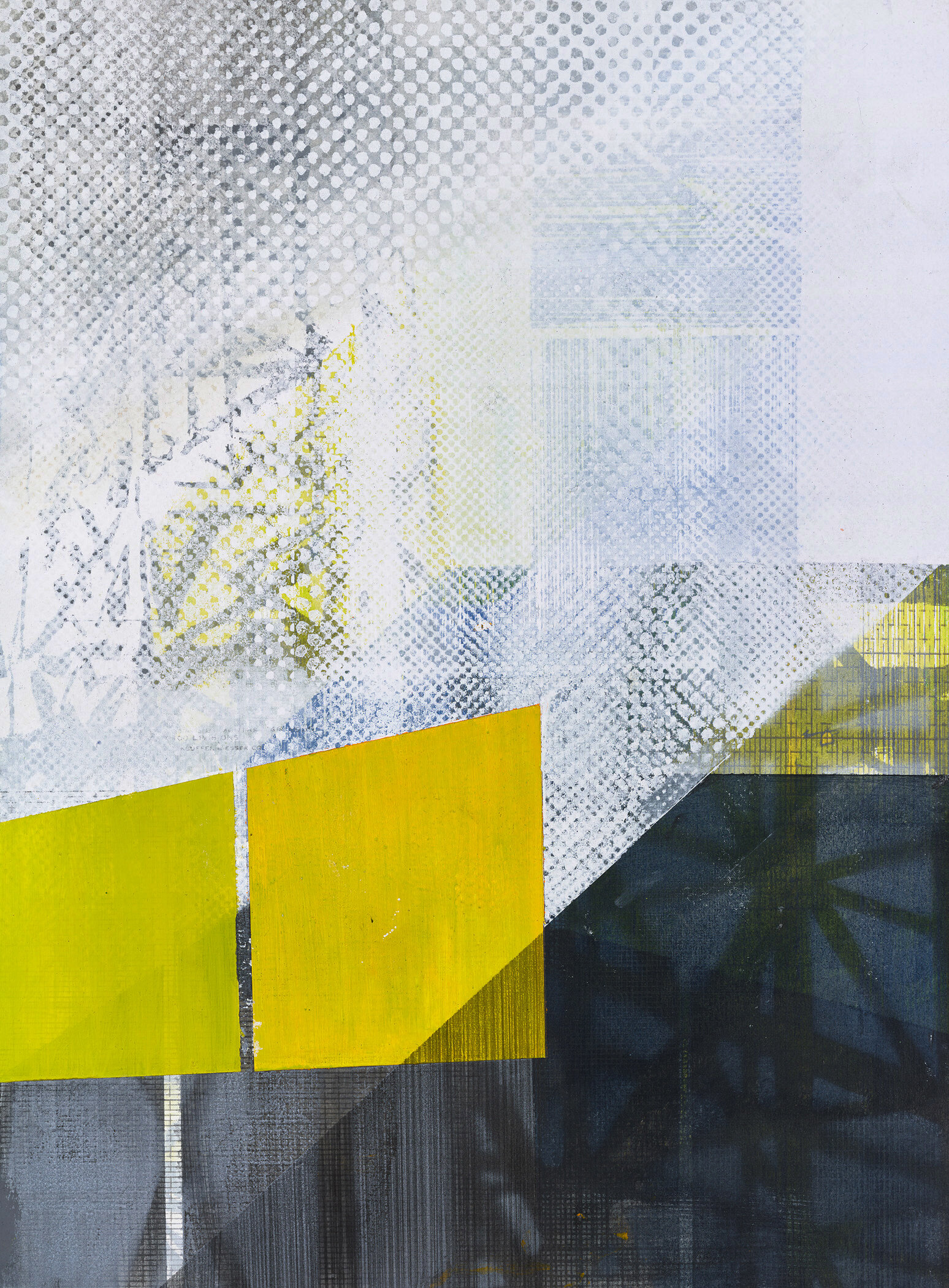
Duwamish Study I, Screen Print, Graphite, & Acrylic on Paper, 14 ¾” x 10 ¾”, 2018.
“I feel that my job is to pay the utmost attention while working in order to get a piece to dance and shift and to create the flatness and volume in proper measure.”
Amanda Knowles is an artist living and working in Seattle, Washington (USA). Her approach to color is tentative and changeable, and her approach to printmaking is adaptive as she experiments with material, mark, and surface. Her intensely layered work is created with screen printing techniques blended with drawing and painting.
Currently Amanda is continuing to work on a series of abstracted mixed media works on paper based in the industrial landscape. She is inspired by the structure shown in the building process and the ultimately hidden supports and infrastructure that are temporarily exposed as a building goes up.
Where do you reside between technical and intuitive in your work as an artist using color?
Intuitive…. Two quick, personal stories about color: 1. As a child I lived 2 houses from a stop light and when tucked in at night in my second floor bedroom I was lulled to sleep by the entire room changing from green to yellow to red in a constant rhythmic cadence. 2. When I was just out of graduate school I was awarded a residency at Kala Art Institute. I spent 6 months in Berkeley trying to find colors that competed with the quality of light and brilliant blue of the sky.
These kind of experiences set us up and we realize the importance of color, the unusual subtleties and the loud clapping hand of color that make us pay attention. Currently, I vacillate between times when gray (mirroring the cloud cover that nestles over Seattle for 9 months a year) takes over and others when I am enchanted by brilliant color and pull that from my surroundings, the oranges, reds and blues of wraps, fences and cladding at construction sites.
I think of the latter as times that I look to color pleading for a change. Also, I am always amazed how the smartest folks, those same people who use color beautifully, say that they don’t know how to use color. Color is that slippery, that humbling. So I have to remind myself to dive in.

City View, Screen Print, Graphite, Acrylic on Paper, 15” x 22”, 2020.

Untitled (construct) I-VIII, Mixed Media on Paper, 52" x 82" (8@ 26” x 20 ½”), 2018.
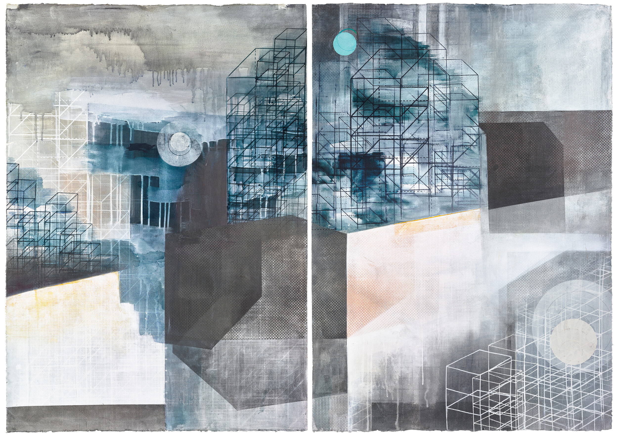
Construction View I, Screen Print, Graphite, Acrylic on Paper, 44” x 60” (2 @ 44” x 30”), 2019.
“I am always amazed how the smartest folks, those same people who use color beautifully, say that they don’t know how to use color. Color is that slippery, that humbling. So I have to remind myself to dive in.”
How does the printmaking process itself relate to how you work with color?
I do my thought process, my sketchbook work, with a camera (Iphone and Holga plastic camera). I take the photos, look at them, then forget them. Afterwards I use them as proof that I was paying a certain kind of attention, but not studying them fixedly.
My work is built up in layers each rinsed and smeared, printed and drawn. They begin loose and colorful. I begin with similar marks on multiple pieces and build and combine. They change wildly as I work. I do not preconceive the work, instead I watch each print as it develops its own directions and outcomes. I work and rework - building and covering in layers.
This layering sometimes feels like constant improvement, but it builds nuance to a form. By adding a printed texture, a layer of pearlescence, a tinted transparency, or solid color the pieces seem to magically change, brighten or deepen, showing the shadowing and mottling that happens across every surface. I feel that my job is to pay the utmost attention while working in order to get a piece to dance and shift and to create the flatness and volume in proper measure.
If you could eat a color for dinner, what color would you choose and how would it taste?
Shimmering, sparkling silver would be sharp, but calming and cooling. Dairylide yellow would taste like soft comfort food, but energizing and invigorating. I would eat them as one would take tonics: Silver on the days that I am keyed up and that lovely, warm yellow to add energy on those days that lag.

Built Environment, Screen Print, Graphite, Acrylic on Paper, 31” x 34 ½”, 2020.