Amze Emmons
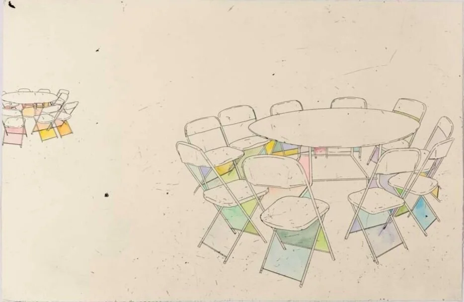
Focus Clarity, etching with hand coloring, 24x36”, 2017
“...there is a relationship to the history of the printed image that connects all visual cultural material.”
Amze Emmons is an artist living and working in Philadelphia, Pennsylvania (USA). His approach to color is often strangely playful, and his approach to printmaking is experimental, often using chance and craft to trouble traditional expectations. Amze’s distinctive depictions of mundane objects and depopulated, urban landscapes are often created by combining several printmaking techniques with hand-coloring. Currently Amze is working on a series of prints putting the precarious quality of drawing into tension with the authority of the printed mark.
Amze’s mid-career retrospective, Pattern Drift: Cityscape is up through April at the Ross Museum of Art at Ohio Wesleyan University in Delaware, Ohio. In addition, he is completing a new suite of prints with Flying Horse Editions at the University of Central Florida, Orlando, Florida.
How does color represent or support the mind space of your work?
The color is my work helps to support the mind space or mood that I am hoping to evoke. This can seem somewhat contradictory, since my palette often functions as a foil to the content described in the imagery. For example, you might see an image that conveys a place that appears to be on the losing end of an argument with global market capitalism, but the colors are by contrast vibrant and playful.
In all the ways that color can evoke powerful and complex feelings, I am hoping that my color choices might draw a few contradictions to the surface. I want people to linger. We scroll past our lives so fast that we are apt to miss something. I hope the bright cheerful colors I choose might be inviting enough for someone to stay long enough to engage on a deeper level.
Also, these colors necessarily fall into the tradition of pop-I find most of my colors inside our visual and material culture-I am literally coloring the images I make with the palette used to sell everything in our consumer culture, and in doing so I hope to make the familiar strange enough that we may notice it with fresh eyes.
And in the end, my library of color refers back to printmaking and the printed image, and I find great pleasure in mining and mixing colors from that rich history and putting them into new circumstances.
If this all seems overly complex and at times contradictory, that is a fair observation. We do, after all, live in a world where the red of Coca Cola ™️ is practically indistinguishable from the red used during the Cultural Revolution.
Collaborative print with Qiaoyi Shi [Detail], Mobile Suit Watermelon (1), screen print, 15.5x13”, edition of 5, 2019.
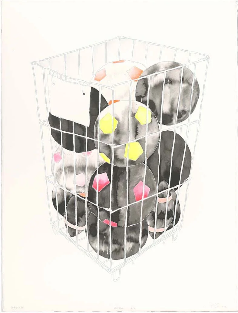
The Study of the Rules Governing Exceptions 003, etching, graphite, gouache, rubber-stamp on paper, 18x24", 2014
“...my palette often functions as a foil to the content described in the imagery.”
Are there specific associations towards color in your work?
Researching color is a distinct activity in my life and practice as an artist. I suppose the easiest way to describe it is a kind of collecting. I find new colors all the time. I might take a picture of flower petals in a puddle after the rain, or the window display in a small kiosk selling lottery tickets, or screen-capture a ‘sponsored post’, or a scene from an anime or video game stream. This all started when I was younger, before I even thought of myself as an artist, I would always collect bits of printed ephemera, matchbook, postcard, or comic books, event toy packaging, and newspaper or magazine clippings. Looking back at it, there is a relationship to the history of the printed image that connects all visual cultural material.
Once it reaches my studio it becomes a kind of library of color that I utilize to develop my palette and explore particular color relationships. In this way (looking at my studio wall), the vibrant tasty colors from a screen capture of a bento box from a Studio Ghibli film might be put into conversation with the faded color of a library punchcard from the 60s.
I’m interested in the way the things we make and consume connect us to each other, so drawing my colors from material culture, and not nature, speaks directly to that impulse for me. Although that might be too subtle a connection for most people looking at my work. That is fine with me, I hope the colors will invite them to linger long enough to draw their own conclusions.
Tokamak, screen print with hand coloring, 2020
Levity, screen print (front and back) with laser cut elements, 15x20”, 2018
What color do you wish you could buy?
The color would be called Heimweh, which is the German word for homesickness. Because of the special pigment used, this color would appear differently for everyone viewing it, depending on the circumstances the viewer would not so much ‘see’ the color as have an epiphanic experience, triggering a memory of a color from their past when they felt care or welcome. For example, if I were to look at this color in the fall I would always see a color resembling the pale brittle yellow of August-dry corn fields waiting for the harvest.
The reflective qualities of this color would make it practically impossible to work with, as everyone would see it differently. In truth I would barely use it in my work, but on slow days I would dab some out onto my palette and allow my mind to wander, and dwell on all the places and people that have offered some kind of shelter for me over the years.

![Collaborative print with Qiaoyi Shi [Detail], Mobile Suit Watermelon (1), screen print, 15.5x13”, edition of 5, 2019.](https://images.squarespace-cdn.com/content/v1/5fc2b5069698b02c7f2c3f93/1618967232401-BAUCGHB6PCFV5N3MVQTR/collabdetail.jpg)


