
Charles Beneke

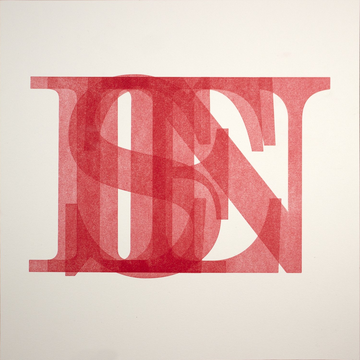
Yesterday, Today, Tomorrow, 2021, letterpress, 12 x 12 inches.
“There are many ways that color feels alive, but when the luminosity of paper electrifies a layer of ink as it shines through, I feel a surge of energy.”
Charles Beneke is an artist living and working in Akron, Ohio (USA). His approach to color is thoughtful and experimental. Charles believes that each print medium/art form has its own distinct voice that can support, enrich, or detract from a work’s conceptual goals. Like the notion that form should follow function, he creates works in which art form and print media follow content. His prints and installations have been driven by the desire to effect change in individuals’ responsibility related to climate change.
Charles works with diverse printmaking techniques, most recently focusing upon lithography, screenprint, and letterpress. Currently he is exploring new conceptual paths investigating the use of language—letterforms and words—to manifest objects of thought and shifting from the idea of searching for light in a dark world to creating brilliance and joy through the use of light and color.
Are there specific associations towards color in your work?
When working on a print or print-based installation/intervention, I avail every decision as an occasion to instill meaning and communicate. To meet my viewer somewhere between my consciousness and theirs’, I include visual cues to pinpoint commonalities. Seizing these opportunities brings us together into a region of discourse to engage in a sort of discussion. Within this space we can explore ideas, examine differences, and learn from each other.
“While color at times asserts statements, at others its role is to ask questions.”

Specter, 2015, Akron Art Museum, Akron, Ohio, August 1, 2015 – January 3, 2016, screenprint and woodcut on Tyvek, monoprint on washi, and laser cut paper.
Whenever I use color, it is with a specific intent. At times these choices are related to stereotypical associations with color, like blue representing the purity of dreams and limitlessness of the sky. Mixing that blue with burnt umber recalls the grime of pollution which stains our natural world and hinders both its natural beauty and ability to sustain life.
At other times I use the juxtapositions and transitions of colors to speak about the liminal spaces between the contradictions we experience. Verdant greens can point to the natural world thriving while electric oranges convey alarm and danger. Side by side they are invigorating. The mucky browns created by mixing the two, however, speak of the compromised, dirty place we occupy between the two–what we have lost, where we are headed, and our need to change. While color at times asserts statements, at others its role is to ask questions.

Specter, 2015, Akron Art Museum, Akron, Ohio, August 1, 2015 – January 3, 2016, screenprint and woodcut on Tyvek, monoprint on washi, and laser cut paper.

Hell! Yes!, 2021, lithograph, 28 x 22 inches.
“The printmaking process relates to everything in my work whether it is this evolution from idea to final image, the kind of marks I make, and the way I want ink to merge with or sit on paper, or how I work with color. It has also helped me understand how to navigate life and all its adventures.”
What would your work be without color?
In graduate school I was always both excited and trepidatious when I had a critique scheduled with one of my mentors. We got on really well. His feedback was valuable because it was insightful and left me asking more questions about my work than I had before he arrived. He was also one of those professors who seemed as much of a Hollywood parody of an art professor as he was an amazing artist and educator. He was the kind of professor who was as likely to be direct and clear as he was to be obtuse. He might provide explicit feedback or look at the work, walk to the door, and just before leaving turn to say:
“Fuck, fuck, fuck, fuck, fuck, fuck, fuck, fuck, fuck, fuck, fuck, fuck. What does it mean? Does it have meaning? It’s just four letters strung together. When you say it over and over, it’s just a sound. The only meaning it has is that which we assign it.”
One particular afternoon he looked at my work, looked at me, looked back at the work, and then meeting my gaze once more he said “You are terrible with color. You really should only be using black and white.” That day I was perplexed. The next day I was unsettled. The following day I started limiting my work to black and white.
Through experience I know what my work is without color. While I learned a lot from this period about the complexity of a seemingly simple palette—black, white, and a range of grays—and while I have still always used color in my work—even if it was just about tone and temperature— today I remain nervous about color. It took me a number of years to allow myself to fully dive back into it.
I am glad for that split second comment from my professor and the larger-than-life impression it made upon me. I’m glad for that itching concern in the corner of my brain that drives me to always question the effectiveness of my use of color. Grappling with these things has taught me the powerful range of possibilities to be found when working with achromatic color and the endless potential of the thoughtful, measured control of chromatic color as a communicative tool. That is something for which I am immeasurably grateful.

How does the printmaking process itself relate to how you work with color?
The most important thing that I have learned from the printmaking process is how to think as a printmaker. All artists develop thought processes and ways of creating their work relative to their chosen medium. I had repeated developing in one sentence and wanted to adjust.The complexity of printmaking teaches invaluable organizational skills, the importance of continuous methodical and critical analysis, and pragmatic approach to art making—construct ideas; take them apart; build images through layers; meet surprise; problem-solve, know when to accept the unexpected, when to work with it, and when to change track; embrace the development of image through process; knowing when to say it's done. The printmaking process relates to everything in my work whether it is this evolution from idea to final image, the kind of marks I make, and the way I want ink to merge with or sit on paper, or how I work with color. It has also helped me understand how to navigate life and all its adventures.
Color, including challenges and joys, is at the heart of my romance with printmaking. It is embedded in every stage of process/practice and is highly influenced by it. The pairing and layering of colors that happens in printmaking is magic to me. Every time I pull the first proof of a new layer in an image I am excited by what I will find—the shock of the unexpected, the joy of hitting the mark, the disappointment of a misstep. There is always a lesson. As I plan an image or mix ink, I always rely on my knowledge of color theory to guide me in the direction of meeting my desired goals, but even then there are the moments that make me cock my head and wonder.
The density and transparency of color is embedded in printmaking processes and outcomes. In recent years I have found these qualities of color, printmaking ink, and their interaction with paper to be especially inspiring. There are many ways that color feels alive, but when the luminosity of paper electrifies a layer of ink as it shines through, I feel a surge of energy. The change of state from a mound of material on a glass slab to the incarnation of observations and emotions on paper never ceases to amaze me. I believe that my experience with developing and proofing an image in black and white and then witnessing the transition–from position on the value scale to density of ink–has pushed me towards new understandings of color, value, and the role that they each play in the impact of a completed work. Color always leaves me wanting more color!

Show Up!, 2021, letterpress, 12 x 12 inches.
Listen, 2021, letterpress, 12 x 12 inches.