
David Lopes
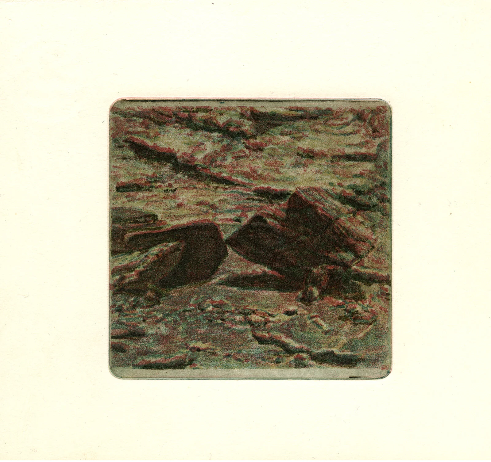
s/título, polychromatic soft-ground etching, 10 x 10 cm, 2017
“The intuitive way of working with color in printmaking can be understood as similar to making a painting, because you’re adding new layers of information in color, and following what appears to be next logical step, not knowing where it leads.”
David Lopes is an artist living and working in Porto (Portugal). He often works with analogous hues in his approach to color, and his approach to printmaking is interdisciplinary. The multi-layered surfaces of his work are made through etching processes, and he also works in watercolor painting. David is currently enrolled in a PhD program in Fine Arts at Faculdade de Belas Artes da Universidade do Porto, where he is also working within the faculty on a new printmaking research center, In Pure Print. David focuses his own study on photomechanical printing processes from the 19th century.
What cultural aspects of color are built into your work?
Focusing on color specifically, I believe my work is culturally dependent within our contemporality. I'm interested in how we perceive images from the past, in how those haved aged and in what conditions they have reached our time.

Venus as seen through a telescope, (process documentation) polychromatic soft-ground etching, 2018
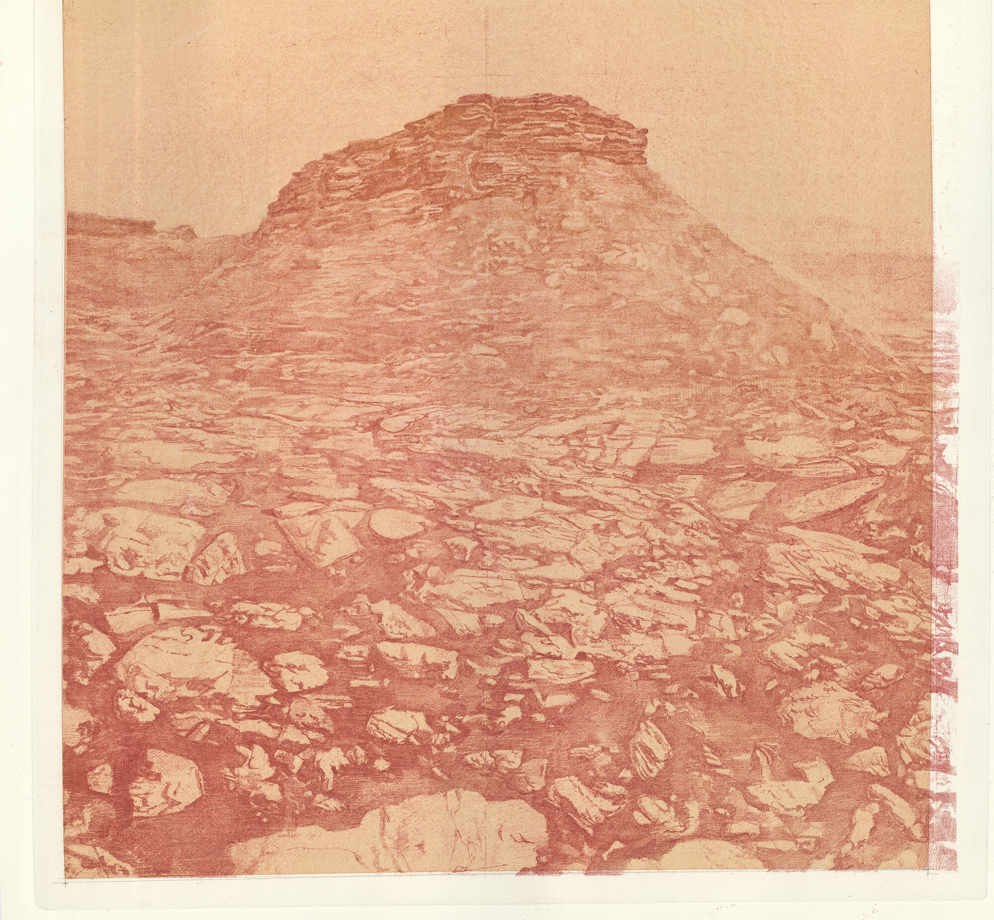
seeing Mars, soft-ground etching on top of watercolor painting, 40 x 45 cm, 2017
“With printmaking you may not know the direction you want to give your work until you see it.”
Are there specific associations towards color in your work?
The role of color is quite obvious for me now, but it started unintentionally. When I began working with printmaking I knew from the very beginning that I had a distaste for pure white printmaking papers. For this reason, I always ended up buying and printing on top of bistre toned papers.
Later on, because I have a background in painting, I started dyeing the surfaces of printmaking papers with watercolor inks. My goal was mostly to create a background tone to print on top of - an attempt to imitate colored printmaking papers. However, this method lasted with me; it allowed me to manipulate more creatively the outcome result and it always kept me curious to see how the printed image would be affected by the background color. Then, I started blending painting and printing more efficiently, either by printing on top of figurative paintings, or painting on top of prints. As a direct reference, I can point out the prints of the Dutch printmaker Hercules Seghers - although his work came to my knowledge much later.
The subjects and themes of my projects are often grounded in reality, especially in history. When researching for these projects, I end up collecting a lot of material and images from past centuries - those can be prints, drawings, paintings, texts, etc. It's common knowledge, that paper sheets tend to get yellow with the passage of time. The same happens to paintings because of the protective layer of varnish oxidizes. I came to the conclusion that we see images from past centuries filtered in a yellow ochre hue. And I recognize now, my colors selection, displayed in my work, matches the yellow hue, typically seen in old pictures.
How does the printmaking process itself relate to how you work with color?
I've mentioned earlier my background education in painting, which I believe is relevant to this question. I struggled a lot with painting as a process and I found painting imprisoning. It's funny to say this, because painters often find also printmaking imprisoning - which is a fair observation in the sense that printmaking is so tied to its protocols and traditional processes.
Personally, I found it difficult not to see painting as this non-editable chain of events. If you like the earlier stage of your artwork, you won't be able to get it back (well, at least not with traditional painting mediums). Printmaking is sometimes a tedious activity–time-consuming, protocol-based, machinery dependent - but it allows you to see your work in multiple variations of itself.
In showcasing this advantage, I think color is the most obvious example. If you don't lose the matrix, you can see how your work embodies different colors, transparencies, different binders, etc., and printmaking alone can provide these options. With printmaking you may not know the direction you want to give your work until you see it.
How does color represent or support the mind space of your work?
To me this is an aesthetic preference. I don't have a particular distaste for the black and white, but I do have a distaste for contrast and sharp shapes in prints, typically seen in linocuts and woodcuts. I prefer the subtle marks given by tone techniques.

Galileo, soft-ground etching on top of watercolor painting, 82 x 72 cm, 2018. Photo by: Teresa Chow

Exhibition view at Casa da Imagem, Vila Nova de Gaia, Portugal. Landscapes of mars in soft-ground etching and watercolor painting. Photo by: Marta Soutinho Alves.
Where do you reside between technical and intuitive in your work as an artist using color?
In practical terms I tend to produce polychromatic prints, either by (1) using only printing processes or (2) by adding painting to my images. In these two scenarios, I either control and plan the entire process, or I have an intuitive understanding of how the work should develop from an initial state.
In controlling the printmaking process I sometimes use the four-colored matrix method. We know it from the industrial printing as CMYK, as in, cyan (blue), magenta (red), yellow, and key or black. This method is not intuitive, because it requires a lot of planning to register and separate the color onto four matrixes, later to be combined.
The intuitive way of working with color in printmaking, can be understood as similar to making a painting, because you're adding new layers of information in color, and following what appears to be next logical step, not knowing where it leads.