
Karen Kunc

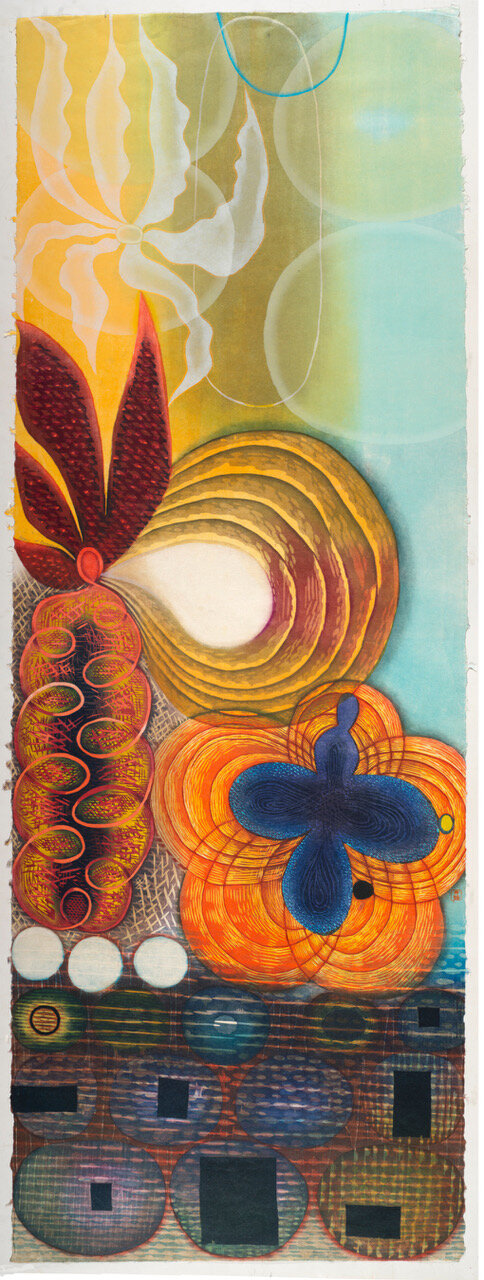
Essence of Abydos, woodcut, 2017, 14” x 29”
“My printing process has made an “event” of the ink layering, of the evolutionary time and stages as colors get printed that reveal the image developing. Nothing else can match this way of working for me.”
Karen Kunc is an artist living and working in Lincoln, Nebraska (USA). Her approach to color is intuitive, nuanced and intense, and her approach to printmaking is traditional with contemporary innovations. Karen’s nature-based and lyrical abstration work is created with color reduction woodcut printmaking techniques and she also makes artists books. Currently she is working on a new series of large woodcuts with metaphoric imagery, as well as a new series of small-scale etchings for a book project that is still in the incubation stage.
Where do you reside between technical and intuitive in your work as an artist using color?
I am very much intuitive with my color use, and do not want to demystify too much how color works for me! I do intuitively rely on color effects of simultaneous contrasts of complimentary colors. I learned years ago how to work with transparent color, allowing for many layers and intensities to build slowly. I have a lot of experience with how to work and what to use and mix into my inks, so that I don’t need to do as much extensive proofing, and color mixing. Yet, I am still discovering new ways that color works.
I really believe that colors “speak” to me…..as I look while printing and studying each stage, while seeking for some color sense that seems to be needed….it calls to put something there, to bring that color in, to see something in the next run that responds or reacts to what has already been printed. That is the best state to be in for me, when the colors and the developing image starts to take over and lead me on.
“One cannot hide color once it is printed, so finding the resolution to a color relationship must be worked out, and always leads me to somewhere unusual and surprising.”

Coral Sanctuary, woodcut, 2019, 72” x 26”

Distillation, woodcut, etching, pochoir, watercolor, 2018, 12” x 24”
“I “stretch” the ink, by rolling, rolling, rolling….. making it become malleable as it blends out. This allows for additional layers to be printed on top, and greater subtilties and complexities. Ink is not like paint, and is more rich, transparent, strong.”
“I really believe that colors “speak” to me.”

Fury & Flow, woodcut, 2019, 13” x 36”

Rifts of Condensities, woodcut, 2016, 14” x 29”
How does the printmaking process itself relate to how you work with color?
Printmaking is always a challenge for color usage, as you cannot use “everything”, so there is a honing down of choices, that fits with the essentials/editing that is part of print processes and planning.
I use 40 – 50 different color applications within my prints, but never that many layers on top of each other. Each print run is a test of what can be done, how few colors can be used, while also questioning how many can be orchestrated.
I love that tension between choices and possibilities and to see how it all fits together. One cannot hide color once it is printed, so finding the resolution to a color relationship must be worked out, and always leads me to somewhere unusual and surprising…..which is why I make art!
What can printmaking ink achieve regarding color in your work that no other material can?
I am wedded to oil-base lithography inks for my relief printing and know of the properties that it imparts – of luminosity, colors that glow, incredible range of transparencies when mixed with base, to strong intensities. Yet I rarely use ink straight from the can, as it is too dense, and often mix as much as a bit of color with a 90% tint base, to a 50/50 mix, all of which enables more color range from delicate to vivid.
I am enamored of seeing how small a bit of color can affect a mixture, and how it can be surprising still when printed. I can’t predict what a color will look like, even after all these years…..and I really don’t want to be predictable, as I am learning by making.
I am always testing the limits of how little ink to use, to have a fully charged impression that looks “up”. I “stretch” the ink, by rolling, rolling, rolling….. making it become malleable as it blends out. This allows for additional layers to be printed on top, and greater subtleties and complexities. Ink is not like paint, and is more rich, transparent, strong.

Monument Stones, woodcut, etching, pochoir, watercolor, 2018, 12” x 24”
Array of Raressence, woodcut, 2018, 72” x 26”
What would your work be without color?
I know I must use color, as the conceptual and visual challenge I set for myself very early on. I never do color sketches, and I can never preconceive the color results. Yet, I always build a great graphic structure into the composition, and I make a full-size high-contrast graphite drawing to learn about this structure before I get into the printing. These drawings are beautiful, and yet I have rarely shown them. In my work I am going for what the printing can do, which is so special.
My printing process has made an “event” of the ink layering, of the evolutionary time and stages as colors get printed that reveal the image developing, and nothing else can match this way of working for me. I do occasionally make work in black and white…the small etchings, wood engravings, mezzotints, where I am challenged by mark-making for tone and value, that features the strong structure, as the bare bones. Yet I work to make that structure evident in my color prints, as an underlying basis and strength.