
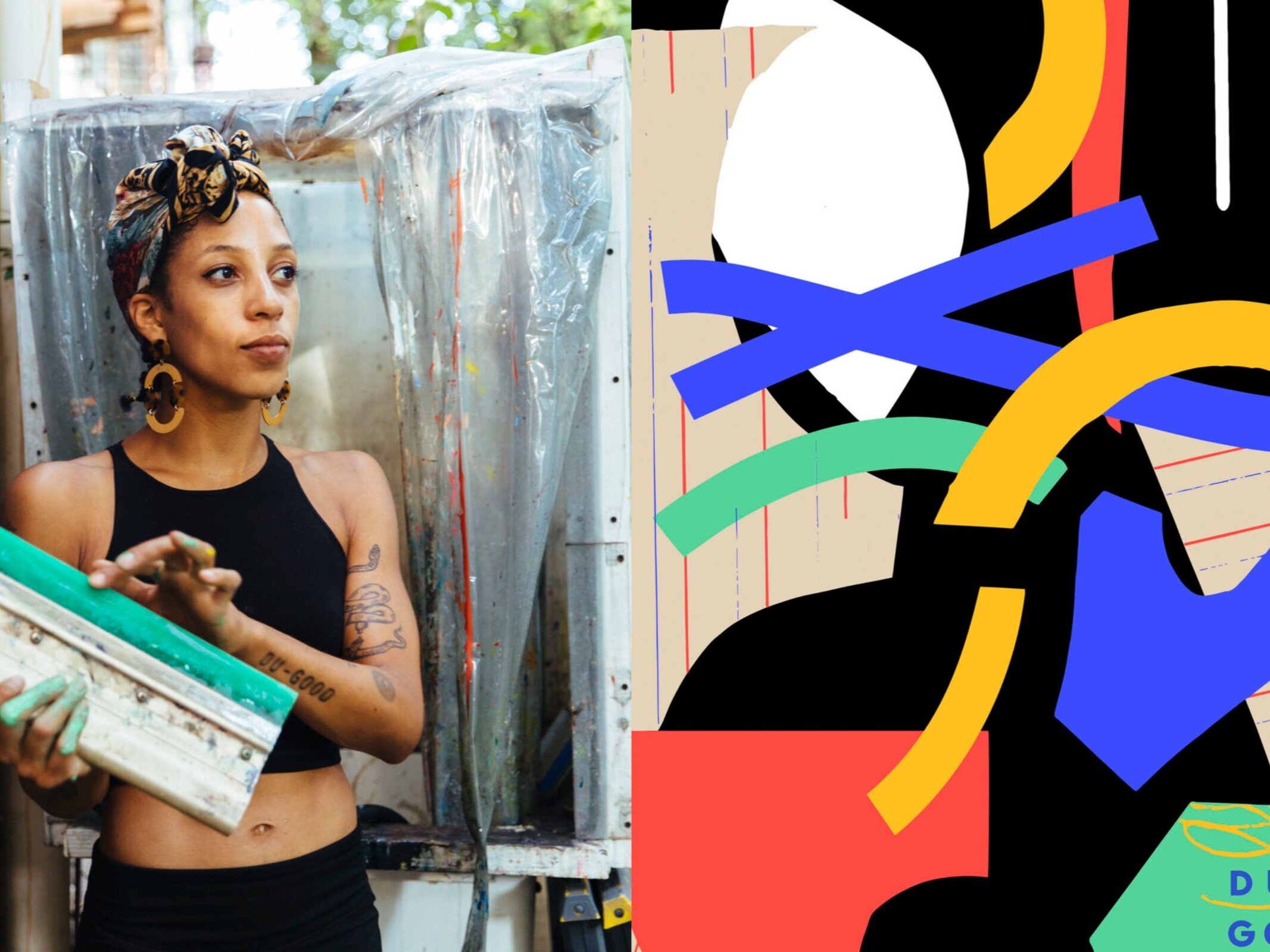
Leslie Diuguid

Nurse 3, COVID-19 by Aya Brown. 9” x 12” 9 Color Screenprint on 100# Kraft Tone French Paper. Edition of 30 Published by the artist. link to the print
“I find it most satisfying to take special care in how the edges, where colors meet, are treated. This type of care should be applied to all governing bodies that set out to protect the most vulnerable.”
Leslie Diuguid is an artist living and working in Brooklyn, New York (USA). Her approach to color is scientific and her approach to printmaking is perceptually adaptive. Leslie’s considerately detail-oriented work is created with screenprint printmaking techniques. Currently she is working on a new printshop buildout for Du-Good Press, her publishing studio and the first and only Black female owned fine art printshop in New York City. Leslie is also working on upcoming editions for Drawer and Summertime Gallery, and artists Brittany Tucker and Ali Printz along with a recent interview with Jo Rosenthal about the Fort Maker's Dreamscape Series that she printed.
“I have to be hypersensitive about color to solve problems...Color can be distracting sometimes. I can’t look at colors singularly but have to take them in with their environment of pairings and relationships.”
Where do you reside between technical and intuitive in your work as an artist using color?
There is for sure a language for mixing colors. I have a playful approach to feeling out what’s right in my own work, but in the science of fine art printing, there are many factors to consider.
When I also was working in other printshops (up until August) I used to just follow the job sheet and try my best to mix the Pantone color and print the thing the way the piece of paper told me to. Most of the time I had no idea what was supposed to happen, I was just a happy printmaker blindly doing what I was told and learning a lot about how inks behave.
Six years of daily color play and press operation has brought me to new understandings especially now that I am doing the separations and communicating with the artist and client about what to expect. I have to associate certain feelings with colors so I know what direction to go and how to mix them at a glance. I still use Pantone books as guides, but mainly season to taste using intuition and analysis on warms, cools, and oppositions.
I have to be hypersensitive about color to solve problems, but I can easily tell when it’s right. Looking at things in black and white to evaluate the value scale helps tremendously too. Color can be distracting sometimes. I can’t look at colors singularly but have to take them in with their environment of pairings and relationships.
It’s a bit of a drive to add a hue in small doses and test in increments. Sometimes I’ll start printing and have to stop immediately once I feel the color could be better. This reevaluation can happen several times throughout the extent of an edition’s production. Using a tiny bit of ink at first and knowing when to stop allows this false start to be efficiently rectified. Despite color tests and drawdowns controlled with matching mesh counts, I never fully know what to expect until I try it out to get a feel for proportion of change more than anything. Printing in the same order each time and shuffling misprints to the top of the pile make for more consistent outcomes with as few mistakes as possible.
Now that I’ve taken on the responsibility of focusing on the entire process full time, I see how the rules of color theory and print production can be used to govern many bodies as they relate to families of shared hue working together.
“Most of the time I had no idea what was supposed to happen, I was just a happy printmaker blindly doing what I was told and learning a lot about how inks behave.”
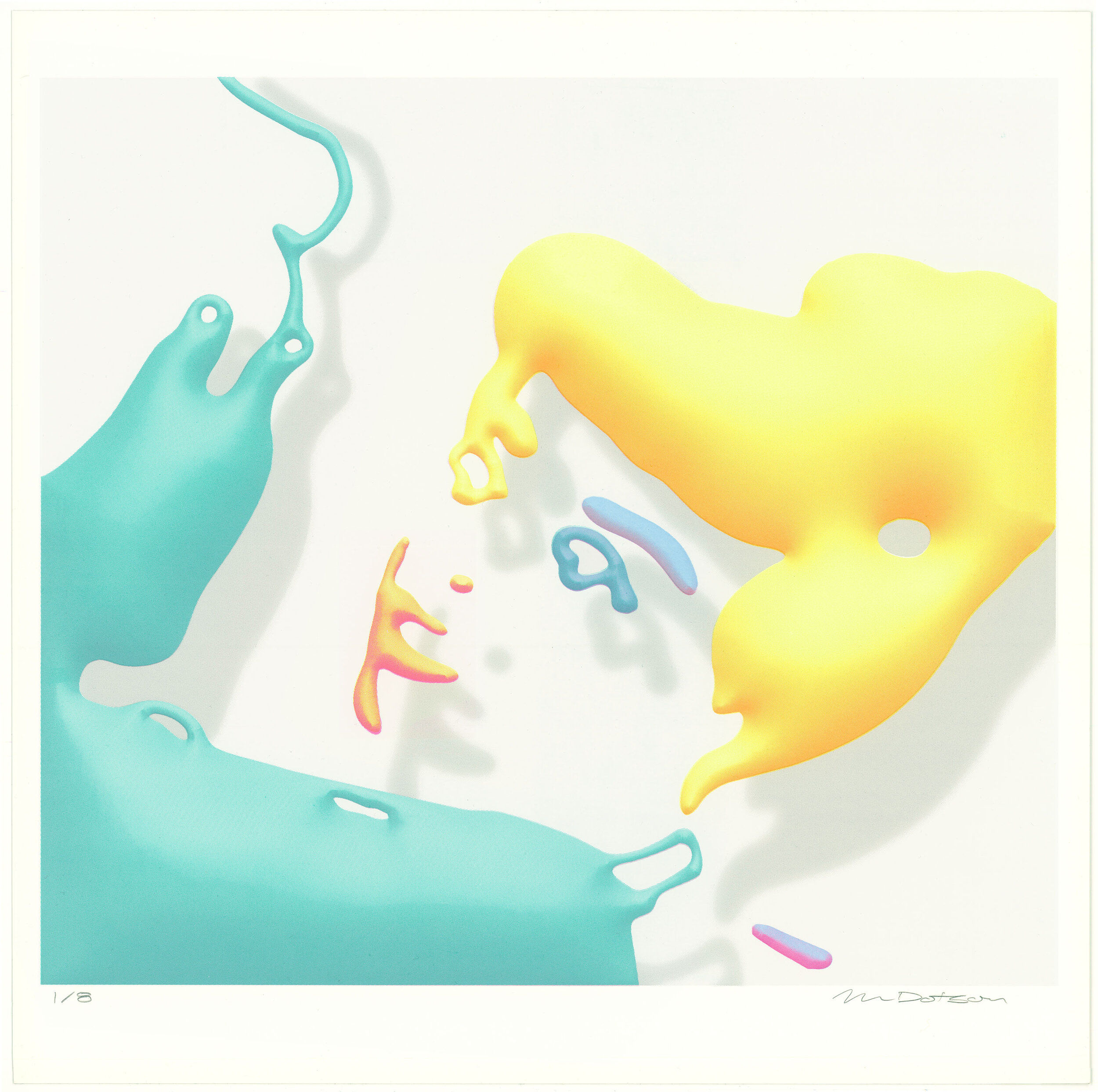
Floating With You by Michael Dotson. 16” x 16” 10 Color Screen Print on 90# Warm White Stonehenge. Edition of 8 Published by Du-Good Press, 2018. link to the print
“Controlling darks and lights is so key throughout the entire process when understanding the primary functions of the spectrum of light. This happens with mixing colors as well and seeing how pure pigments react to light and influence the spectrum that radiates from the surface to your eyes.”
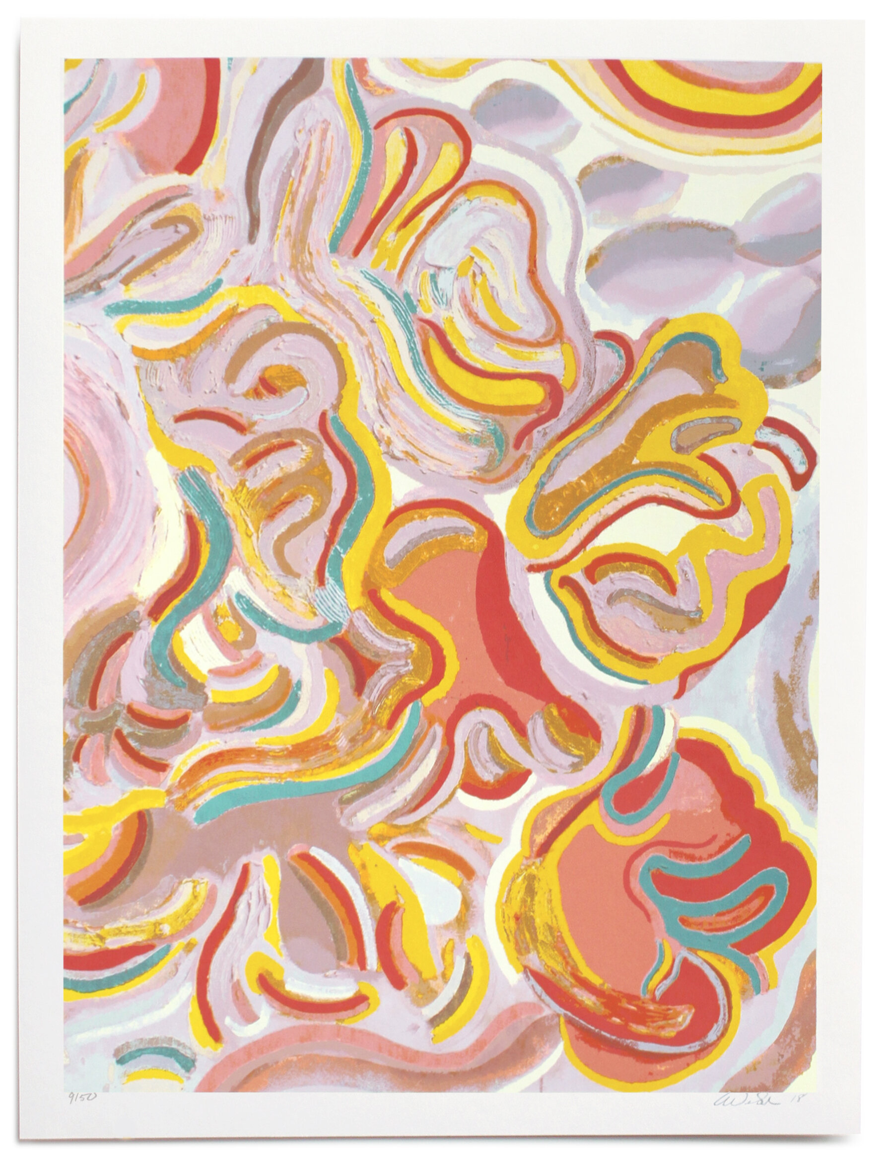
Glory by Erin Lynn Welsh. 18” x 24” 15 Color Screenprint on 335gsm Coventry Rag. Edition of 50 Published by Uprise Art, 2018. link to the print
How does the printmaking process itself relate to how you work with color?
Screenprinting has the benefit of being able to be thoughtful in color combination or avoidance to best achieve the ideal outcome. It’s nice to not get stuck in the monotony of only doing one or two parts of the process anymore. Now that I am doing Du-Good Press full-time, I get to really build an image and interpret an artist's gestures through my own ability. The first part of the process, rendering separations in photoshop, takes a lot of imagination and theoretical color manipulation to reduce the amount of layers into a few overlays which can make different colors when paired throughout the image.
Outputting films and burning screens is also scientific in the way extreme UV light exposure hardens emulsion. The absence of light is what reveals open mesh. Void and fire are what makes the sky blue from our point of view through our atmosphere. Controlling darks and lights is so key throughout the entire process when understanding the primary functions of the spectrum of light. This happens with mixing colors as well and seeing how pure pigments react to light and influence the spectrum that radiates from the surface to your eyes. I first had to learn how to see and appreciate that observation to feel it before categorizing that knowledge into a referenceable form of tastes to be used on-press.
Visual art at its best makes those alive a little more confident of themselves because everything that makes them unique shines through the same perspective shared in the radiant light and knowledge of all of the dazzling possibilities under the sun. LET THERE BE LIGHT! (I get a lot of energy from sunshine).
What can printmaking ink achieve regarding color in your work that no other material can?
Layering colors and being able to control the intensity of pigment can be overwhelming with the amount of options available. For instance, cyan magenta and yellow layered in different frequencies at the same opacity in a rosette halftone pattern can perceptively make the visible spectrum of light from a distance when printed with process inks that were formulated to work like that. Adding process black further expands those outcomes and our brains use pattern recognition to fill in the gaps.
Understanding how those primary relationships work, can make process inks outrageously useful for flavoring other colors in the right direction. There is also so much hiding and tinting that takes place as new colors blanket and react to what’s there. I find it most satisfying to take special care in how the edges, where colors meet, are treated. This type of care should be applied to all governing bodies that set out to protect the most vulnerable. Seams can be designed around registration limitations to better protect those sensitive meeting points which do wonders for the overall image. I’ve been working with low frequency bitmaps recently to simplify and scatter those edges into smooth gradients when necessary to mimic lithography but with screenprinting.
What’s next?
The versatility of screenprinting can be highly adaptable from an artist’s point of view. Photo-Process Tieless Stencil technology and forcing ink through mesh onto a surface has evolved substantially in the last century, but that history lacks innovation from diverse perspectives.
As I graduate into a new chapter, I am aware that my own knowledge and experience can be fortified with lessons learned from the past to ensure my successful longevity. Traditionally, limited access results in limited advancements, but access to information has never been easier than it is today.
My ability to control the variables in my nicely limited environment has allowed for greater experimentation with color and output. The success that I have found in the last few months was in anticipation of expanding into a larger studio to fully actualize my knowledge and build prints responsibly with artists. The world desperately needs to see more Black women leading the way. I am so energized and excited to take on the challenge."
My ideal space to grow and share what I know is necessary to create the change our economy needs. Screenprinting has taught me to be flexible, strong, and sensitive to change. I have a plan to hold screenprinting workshops in parks, community centers and online where I will teach these methods to creatives of all skill levels and ages. Screenprinting as a fabrication tool can be the nexus of change as a means to bring art to the empowered hands of many.

Late by Aliza Morell, 18” x 24” 4 Color Screenprint on 335gsm Coventry Rag. Edition of 100 Published by Uprise Art, 2019. link to the print
What color do you wish you could buy?
Some kind of extreme purple. Like Vanta Black but UV radiation purple electricity kinda.
“Screenprinting as a fabrication tool can be the nexus of change as a means to bring art to the empowered hands of many.”