Mike Sonnichsen
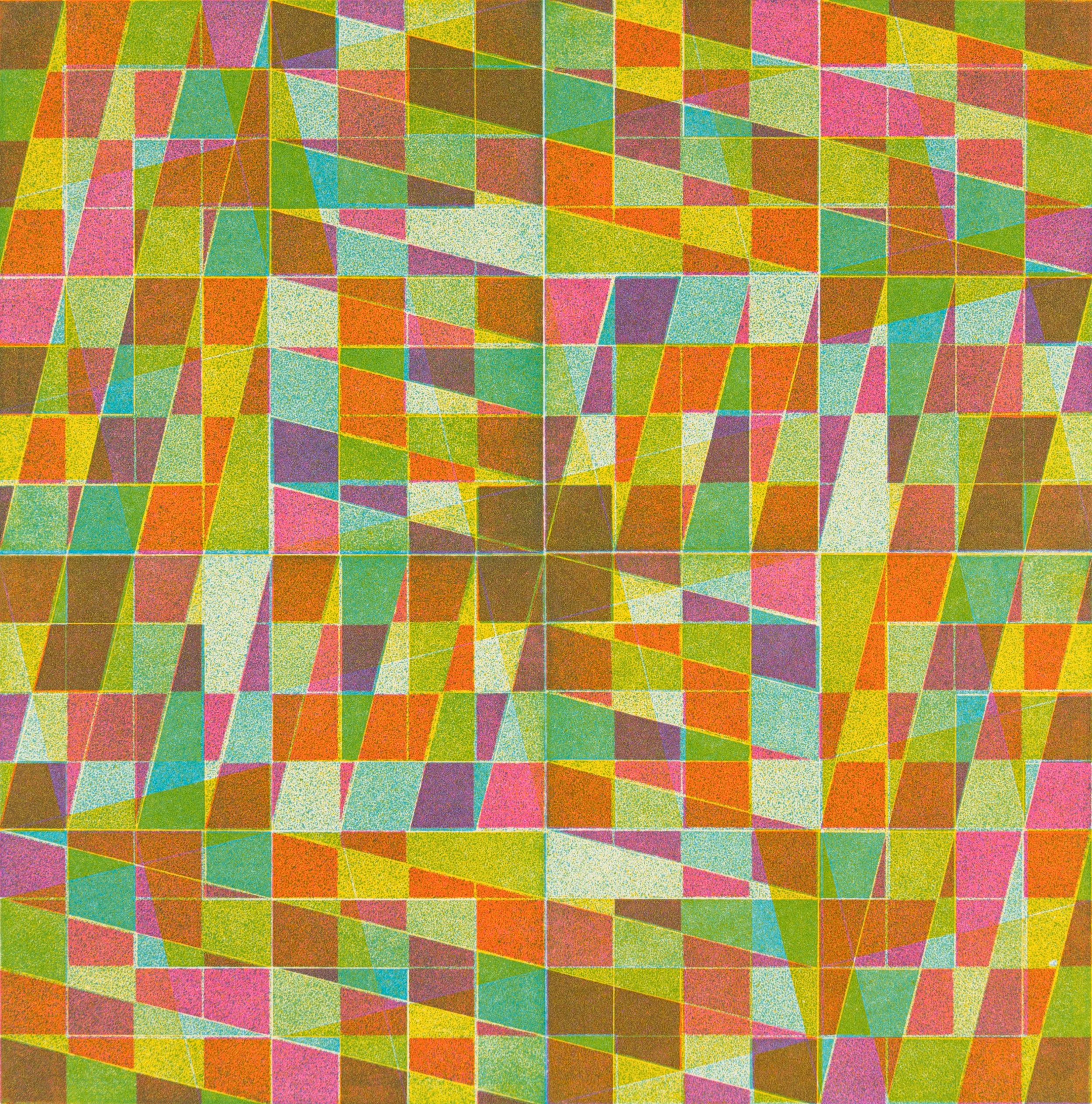
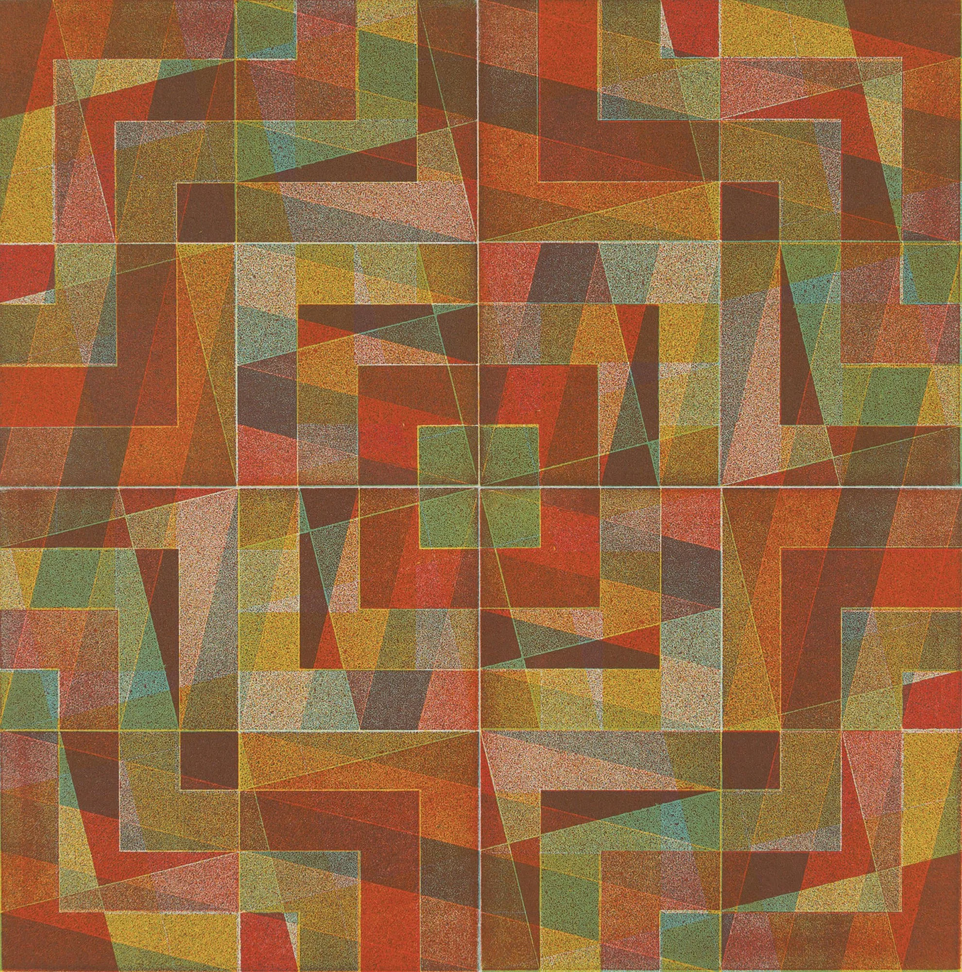
Untitled #20b (from the 8x8 Combine series), 2025, Relief printed from multiple etched plates, 8 × 8 inches.
“I don’t see a dramatic or binary division between the rational and the intuitive with respect to the way we work with inks in hand printmaking.”
Mike Sonnichsen is an artist living and working in Moscow, Idaho (USA). His approach to color is optically dynamic, and his approach to printmaking is systematic yet playful. Mike’s geometric and intensely colorful work is created with lego letterpress, screenprint, and unconventional relief printmaking techniques using etched plates. He also creates sculptural assemblies with colorful familiar objects. Mike is currently working on new bodies of work using collage of found papers, and an art + science collaboration based on retinal cell research of zebrafish.
Are there specific associations towards color in your work?
I spent the first seven years of my life in Puerto Rico, surrounded by the qualities of brilliant tropical light. I also swam and snorkeled and remember not only the vibrant colors of sea life, but immersion in the water environment, a translucent one that filled my whole field of vision. Light passing through water creates its own color range depending on depth and distance, while waves create magnified and dynamic patterns on a sea or pool floor. I’m not the first person to have been enthralled by this nor by the range of frosted “ocean glass” colors that were gathered while beachcombing, but I found the translucent nature of printmaking inks to be an elegant fit with these early sensibilities.
Even when studying architecture (and often being limited to blacks and greys in projects), my first prints exhibited what I would now consider a tropical flair. I would also suggest that my works create a complexity through the layering of patterns akin to focused wave light against a rippled sand sea floor. A visual dynamism in a fixed composition where the viewer almost gets lost following intersections of form and color is what I aim to build via printmaking techniques.
I lived in Japan for three years (much later in life) and have an appreciation for various palettes of color that might be defined as culturally specific. I even wrote about “Rikyu grey,” which imagines this grey containing the richness, if not immediate brilliance, of all colors in combination. Except for a few times, I haven’t explicitly drawn from Japanese moku-hanga woodblock prints or mandala painting, yet these sensibilities are nestled in my color psyche in some way.
During the 2020 lockdown, I was able to execute some Lego letterpress print studies, and flowers in our garden were a small source of optimism at the time. Their pure colors, as well as the weirdly rich and neutral combinations, seem to have sprung from some web of color associations that I can barely consciously recognize.
“...I fell in love with print because of what felt like the magical and sometimes surprising results of color mixing through layering. ”
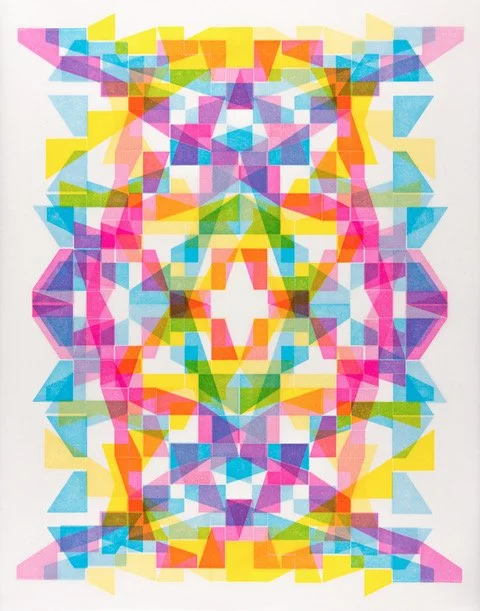
Meanderin' 2, 2021, Lego Letterpress printed recto/verso on vellum, 14 x 11 inches.
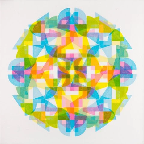
From the Garden of a New Earth, 2020, 4-color Lego letterpress, 9.5 x 9.5 inches.
SQ-SQ V.6, 2022, Lego Letterpress, printed “recto-verso” on vellum, 11 x 11 inches.
How does the printmaking process itself relate to how you work with color?
I think I fell in love with print because of what felt like the magical and sometimes surprising results of color mixing through layering. While a single or a first printed layer doesn’t seem to ask too much of the artist, every subsequent layer requires consideration, choices, and a fair bit of understanding of how different print processes operate.
Recently, I have been letterpress printing on both sides of translucent vellum. The added symmetries, along with another variable of color modulation from the same setup, have challenged my printing skills but reward an aspect of printmaking where repeated elements build complexity.
I love trying to manage the exponential explosion of new color combinations that each run produces, yet I also feel a small pang of regret that some visually intriguing stages get covered up or de-emphasized through the process of the work. I suspect many printmakers have mixed feelings, knowing that only they, the makers, will ever have seen all the intermediate stages of a particular printed piece.
Where do you reside between technical and intuitive in your work as an artist using color?
I’m not sure people will believe me, but I work quite intuitively with color, albeit within what appear to be very rule-guided or systematic visual structures. I often use three color runs or layers in my work, and usually, my matrices are fairly dense and overlapping. To maintain some optical coherency or clarity in the resulting mixed colors, I tend to (very generally) use blues, reds (or magenta/pink), and yellows; these usually “play well with each other”.
My Lego letterpress work might appear to stay close to process C,M,Y, but any minor tweak (hue, transparency, order of printing) in any of these layers can lead to vastly differing visual results. I love when the drama of brilliant colors lies side by side in a print, yet neutralize each other to a degree in an adjacent space. Being able to read this map-like “key” to the components of the print reveals, for me, evidence of a process logic and may help a viewer disentangle its making. I may sound more like a technician, but having made countless batches of ink and accompanying drawdowns for various processes gets me to a place where I “have a hunch” about which color choices will function well enough for a project.
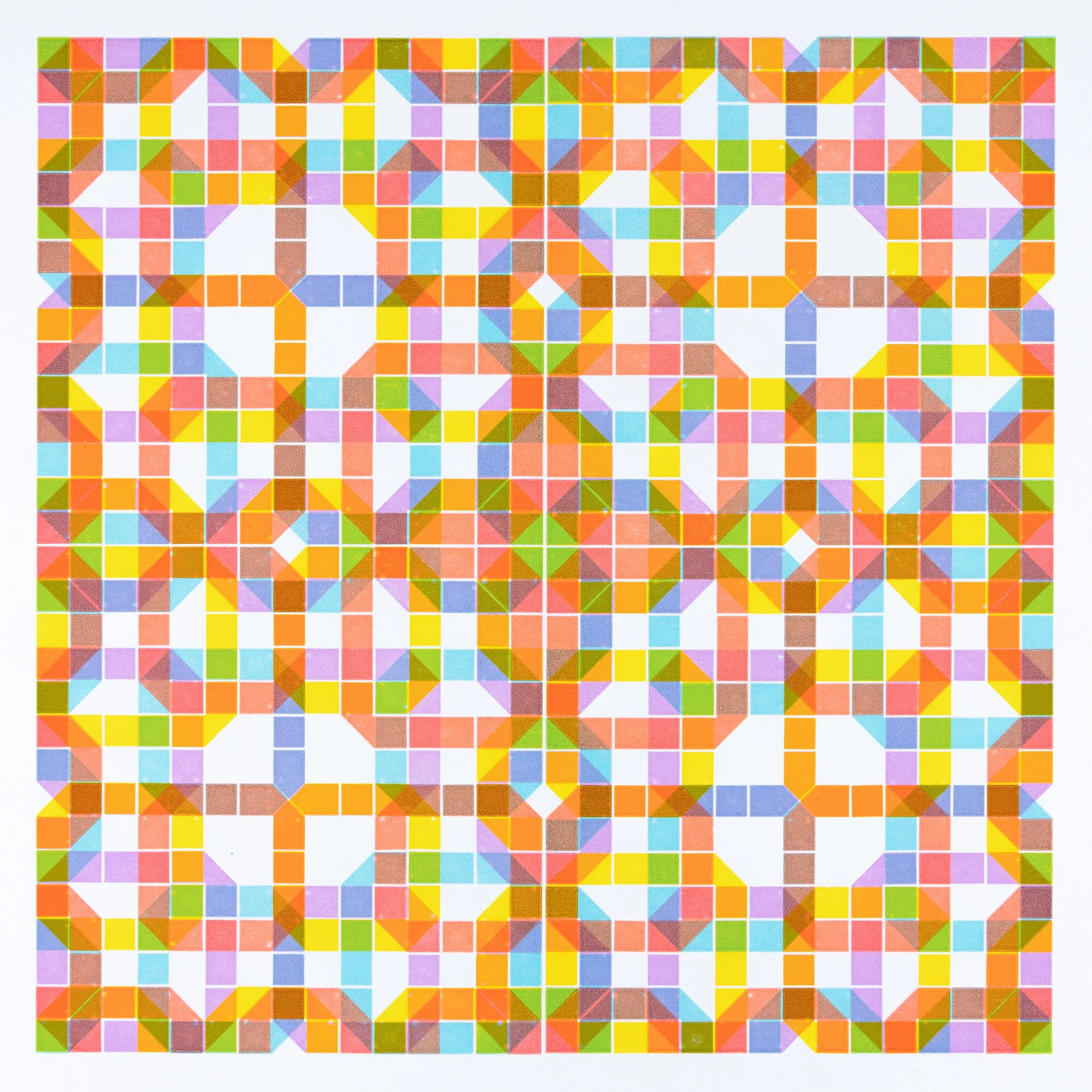
Untitled #89 (from the 8 x 8 series), 2023, Relief printed from multiple etched plates, 8 x 8 inches.
Untitled #51 (from the 8 x 8 series), 2016, Relief printed from multiple etched plates, 8 x 8 inches.
I worked with John Cage at the Mountain Lake Workshops and respect his use of chance operations in creative undertakings as a way of opening work to opportunity and minimizing the artist’s intention. I usually cut paper to a few different sizes for letterpress work to see what novel or unplanned visual combinations might arise. And while I admit to bringing a fairly “systematic play” to my process, not knowing exactly how things will turn out requires that I operate very intuitively within the framework of a project.
Not too long ago, I finally got a copy of “Color by Overprinting” by Donald E. Cook. His triangles and grids of color combinations are, of course, extremely technical, but they are shown in the service of practical and efficient printing of color illustrations. At the same time, the “grid” or technical pages to me are a visual/sensory feast of pure color art; however, I don’t see a dramatic or binary division between the rational and the intuitive with respect to the way we work with inks in hand printmaking.
“I suspect many printmakers have mixed feelings, knowing that only they, the makers, will ever have seen all the intermediate stages of a particular printed piece.”
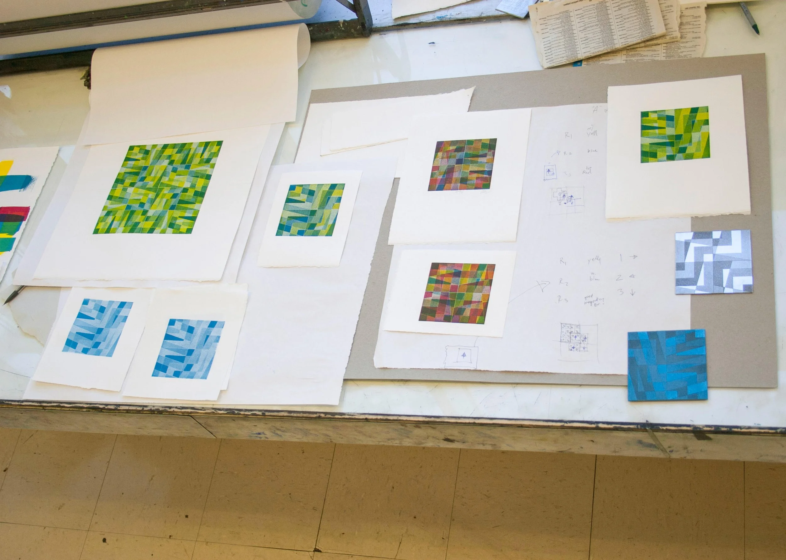
Process image (4 × 4-inch zinc plates): testing blue layers over yellow (with older, 3-color test print guides).
How does your printmaking color sensibility translate into other media?
For better or worse, my architecture training developed my love of materials and objects. I certainly appreciate designed “form families” of objects, but I am profoundly drawn to the particulars of “color families” of similar found objects. While some artists are keen observers of composition or forms, my color senses lead me to ask, “Why are so many ice-cube trays blue?” or “What were designers of melamine dishware thinking in the 60s that looks so particular to that era?”.
My partial answers to these questions usually involve the accumulation of many individual examples of the objects in question with a modest change of context or presentation. If printmaking is the best tool for the job (such as security envelope patterns or flyswatters), I may use print techniques.
I have used photographic darkroom approaches to essentially “print with light” creating color photogram studies of translucent objects. But if the inherent color of the things themselves is sufficiently strong, there seems no reason not to employ certain objects almost “as-is”. I have some issues with our culture of excess and overproduction, particularly of plastics. Yet, the idea that they might exist as “nearly ready-made” sculptures draws me to work to tease out unseen qualities in everyday or discarded things.
While I work on diverse paths of artmaking, color and, to a certain extent, form are the threads that run through everything I do.
Untitled #18b (from the 8x8 Combine series), 2025, Relief printed from multiple etched plates, 8 x 8 inches.
(images above, left to right):
Untitled #104 (from the 8 x 8 series), 2024, Relief printed from multiple etched plates, 8 x 8 inches.
Untitled #90 (from the 8 x 8 series), 2024, Relief printed from multiple etched plates, 8 x 8 inches.
Untitled #10b (from the 8x8 Combine series), 2024, Relief printed from multiple etched plates, 8 x 8 inches.
