
Monika Lin

Double Happiness, Skipping Girls 8, 2007, acrylic, relief printing, resin on wood panel, 40 x 40 x 3cm
“I make a color, print it, then assess its impact.”
Monika Lin is an artist living and working in Shanghai (China) and Philadelphia (USA). Her approach to color is conceptually linked to the subject in her work, and her approach to printmaking is material, aesthetic and conceptual. Monika’s experimental and interdisciplinary work is created with relief printing, engraving, monotype/transfer, stencil, letterpress and digital printmaking techniques. She also works with painting, drawing, stop-motion animation, assemblage, manufacturing, weaving and sewing in her work.
Monika’s most current work includes: Selfsame Sky, Seething Worlds, an "invisible drawing" made from hand-engraving 50 feet long of 2-inch high found plastic lit so that the image on the wall resembles a drawing or print, Lake Tide, a public sculpture installed in Qiandaohu, Hangzhou, China, which addresses the Anthropocene metaphorically through the almost invisible movement of lake tides, and Huang Shu Lang (Siberian weasel) is a series of animations made from relief prints, drawings, and paintings using the huang shu lang as a central figure in a surreal and ever-changing ecosystem.
Are there specific associations towards color in your work?
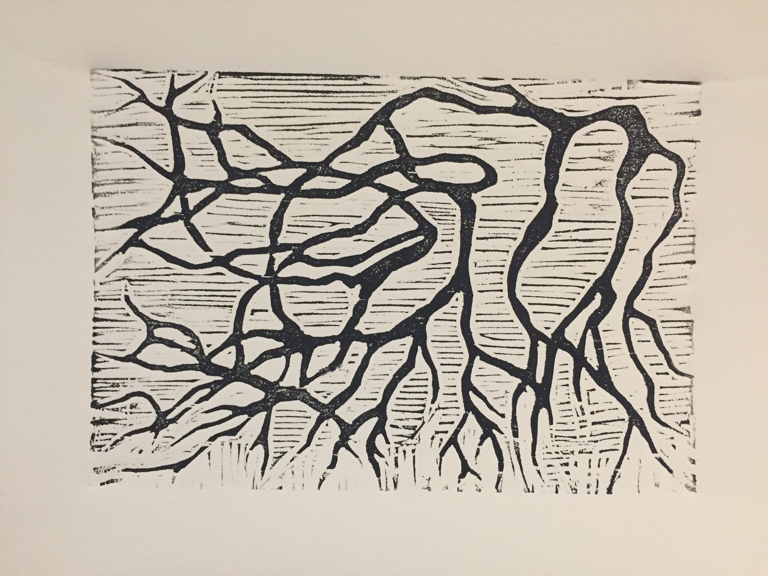
Lu Xun, 2019, Wood block print on Fabriano paper, 22 x 28cm
As most of my work is specifically situated in a cultural, ethnic, and/or historical context, color choices align with those spaces. As an example, I created a series of prints for a new translation of Lu Xun's poems. The new translations resituated Lu Xun's work away from the former romanticized translation of his poems to the raw and direct aesthetic of his fiction work (as a social realist).
Lu Xun is considered the grandfather of the modern era of printmaking in China due to the impact he had on the aesthetics and political transformation of printing in 1920-40s China. Impressed with the possibilities of easy dissemination and political transformation, he brought work by artists such as Kathe Kollwitz and Franz Masereel to China. Therefore, I used the language of the era as well as the poems to create raw woodcut prints in black and grey ink.
Another example is the use of color in "Double Happiness" 2005-2010 - a mixed media series (painting and relief printmaking) that addressed the pharmaceutical industry. I used a saturated candy-colored+1950s palette to instill a sense of overload as well as reference the first publication of "The Diagnostic and Statistical Manual of Mental Disorders" (1952). “Double Happiness” led to “Child Palace,” 2010-12 which sill utilized overly-saturated colors to reflect my experiences of a particular aspect of expatriate and nouveau-riche Shanghai but which also incorporated a muted or polluted aspect. These two series led into “Small Offerings”, 2011-13 which stripped down color to whites, silvers, and greys to indicate a bleaching out of life.

Child Palace, Swimming 1, 2010, acrylic, relief printing, resin on panel, 45 x 70 x 3cm
River, 2017-2020, and Lake Tide, 2022, although sculptural and made primarily from found or cast-off materials, are rooted in printmaking – embedded in my process regardless of materials or forms. These two installations emerge from a generative process, beginning with actual woodblock prints and ending in large-scale sculptural forms. I make multi-layered woodblock prints, digitize them, extract shapes, enlarge those shapes, laser-cut them, and reassemble them as a dimensional installation. Color is determined in the printing stages as my intention is to infuse the overall installation with the way in which layers of ink react to one another – albeit translated into transparent materials and light. The final palette is an approximation of the original printed image.
“...my background across multiple countries continue[s] to inform how I understand and think about color and how I use it to frame my work.”

River, (installation, detail 3), 2017, Recycled plastic sheeting, movie posters, Tyvek constructions bags, Styrofoam insulation, netting and custom-made LED signs, 300 x 450 x 250cm

Lake Tide, 2022, acrylic, steel, solar powered LED lights, sound, 1400 x 600 x 600cm
Where do you reside between technical and intuitive in your work as an artist using color?
After conceptualizing the general perimeters of the color/color palette I wish to use, I move to an experimental stage in trying to find the key color/s. This is equal parts technical and intuitive.
I make a color, print it, then assess its impact. I then intuitively make another color with a specific relationship to the first (I want a particular kind of vibration/contrast/effect). However, I don't consciously know what that color will be; I simply start mixing.
Then, I print both colors and continue in the same way from there. After I have all the colors, I start tweaking them a bit in relation to the subject/composition. This way of working results in a series having multiples printed in vastly different palettes.

Small Offerings, Swimming Girls 2, 2010, acrylic, relief printing, resin on panel, 40 x 40 x 3cm

River, 2016, 4-color woodblock printed on xuan paper, mounted on silk, 90 x 45cm
What cultural aspects of color are built into your work?
As someone who are up in a third-culture environment (US, Swiss and Chinese), I understand color simultaneously in multiple cultures. For instance, in traditional Chinese culture there were 5 colors: black (which is actually blue-black), red, qing 青 (a conflation of the idea of green and blue), white and yellow. Black corresponded to water, yellow to royalty, white to death, qing to nature and red to celebration.
Although white is no longer used to represent death, the other four colors still hold true. Additionally, some colors are perceived vastly differently - what might be seen as "red" or "orange" in Western European culture is often identified as "brown" and "red," respectively. Thus, I consider what I am signaling when I choose a red.
I think of color palettes in the same way. As a teacher at NYU Shanghai, I have dialogues regarding color associations/cultural semiotics every semester with a new group of students. This and my background across multiple countries continue to inform how I understand and think about color and how I use it to frame my work.