
Nicole Pietrantoni

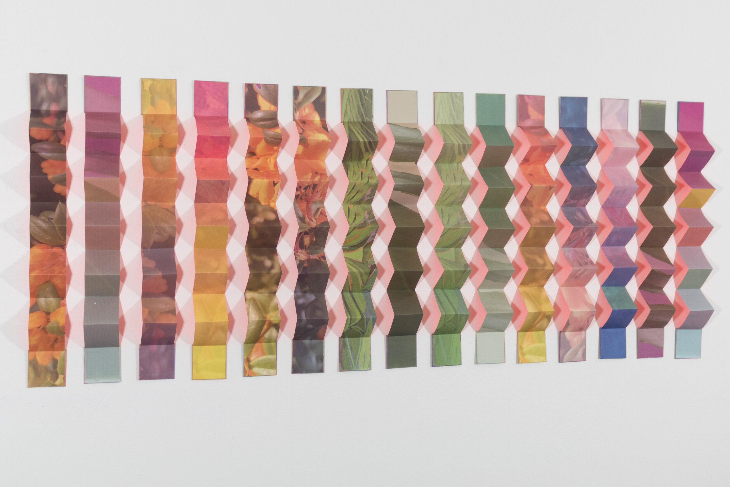
Hothouse, 90” x 170” x 7”, Inkjet on Kozo paper, acrylic paint. Handbound into 17 accordion books. 2020
“I realized that I needed to stop rejecting color and rethink my aversion to beauty – that somehow beauty and complexity and politics were mutually exclusive. They are in fact very deeply intertwined...so I made how we perceive and look at beautiful things (in my case, nature) one of the subjects.”
Nicole Pietrantoni is an artist living and working in Walla Walla, Washington (USA). Her intuitive approach to color involves CMYK (cyan, magenta, yellow, black) halftone printing process and she takes an experimental and expansive approach to printmaking.
Nicole’s colorful folded paper installations explore how humans relate to nature through using inkjet printing, CMYK and silkscreen processes and bookbinding, along with photography, text and ongoing collaborations with poets. Currently she is working on a new series of work for a solo show at Platform Arts in Belfast, Northern Ireland in 2021.
Are there specific associations towards color in your work?
My artwork interrogates the tradition of landscape photography, its relationship to beauty, and how humans see and consume nature. While much of my early art used picturesque images of landscape and text from climate change documents, I am now working much more with abstraction, color, and light – pushing the original images of the natural world to further emphasize their “fakeness,” so to speak, with more heavy-handed editing (such as hyper-saturated and fluorescent color) and installation on my part.
Reproducible images are always highly mediated replicas of what we see, and in my artwork I use the CMYK halftone dots and other interventions like cuts and folds to draw attention to their image-ness – to point to how the image is created, linked to mass media, and embedded in popular culture. Images are always highly mediated, subjective objects circulating throughout our material world with particular viewpoints and intentions. While nature has been the subject matter of my work, at the heart of all my work is an interest in the printed image as an idealized representation of the world that always stands in for another’s desire, political interests, or agendas. Eventually, that desire can unquestioningly become our own.
My relationship to color was deeply influenced by a year I spent in Iceland as a Fulbright recipient – the palette of the landscape there is often a mix of blacks, grays, greens, and whites, but occasionally there would be a neon orange or yellow sign, shelter, or piece of clothing that pierced through the landscape and reminded me of the constant human presence in what is often considered a very remote and unspoiled wilderness. Since then I have paid close attention to neon color in the natural world and began using it in my work to signal human intervention.
“Color is simply light reflecting off of surfaces and being interpreted by our brains – but what our brains do with that information is far from simple - color is about how we see and examining how we’ve been trained to see.”

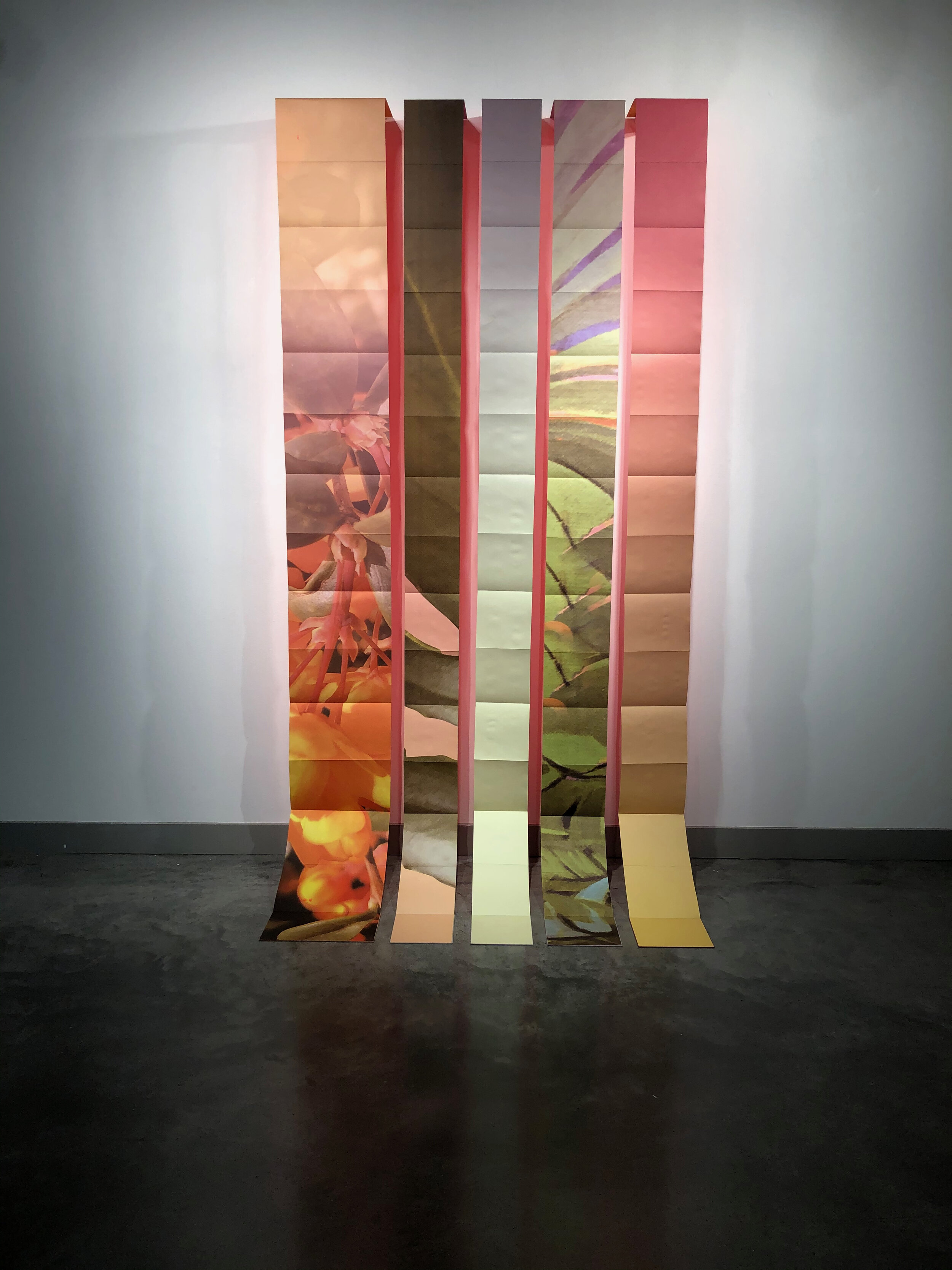
Burgeon (collapsed into book form), Inkjet on Kozo paper, acrylic paint. Handbound into 15 accordion books. 2020
Burgeon, 28" x 64" x 4", Inkjet on Kozo paper, acrylic paint. Handbound into 15 accordion books. 2020
Landscape No. 1, 90" x 62" x 14", Inkjet on Kozo paper, acrylic paint. Handbound into 5 accordion books. 2020
Where do you reside between technical and intuitive in your work as an artist using color?
As an artist it is always interesting to reflect back on work you’ve made and consider your trajectory. Now I can see that I was afraid of color for a long time. I linked color and beauty together and was afraid to make beautiful things. I kept making art that was on a grayscale – white inks and cast shadows created by screenprinting on clear acrylic plates. Somehow, I finally realized that I needed to stop rejecting color and rethink my aversion to beauty – that somehow beauty and complexity and politics were mutually exclusive. They are in fact very deeply intertwined and I’ve finally started the process of unraveling these things. So I finally made how we perceive and look at beautiful things (in my case, nature) one of the subjects of the art.
Working with color has happened slowly but also intuitively – as I began working more with CMYK screenprinting and inkjet printing, I progressively moved forward with a much broader palette, which now includes those fluorescent colors. My recent work uses painted fluorescent oranges and reds to reflect color onto the gallery wall or pedestal. Today I can see that most of my work has always been about light, shadows, reflections, and color. Color is simply light reflecting off of surfaces and being interpreted by our brains – but what our brains do with that information is far from simple - color is about how we see and examining how we’ve been trained to see.

A lapse, a fold, a field, 108” x 300” x 8”, Inkjet on Awagami Inbe Thin, folded and bound into 33 accordion books. 2019
How does the printmaking process itself relate to how you work with color?
Printmaking is integral not just to my process or as a means of production: ultimately, printmaking is the subject of the work. Thinking about the history of printed matter and its influence on a public is very much embedded in everything I make. Therefore, using something like the CMYK (cyan, magenta, yellow, black) printing process links my artwork to historic photographic printing for mass media as well as contemporary printing for magazines, product packaging, and billboards, amongst other printed objects circulating around us today.
CMYK printing was and is a method for standardizing colors for designers and reducing the number of inks and plates needed to create a full palette – just four ink colors to create the illusion of nearly every color. When I first started screenprinting CMYK images I was filled with wonder – it felt like magic to watch each successive layer of dots blend together and come into focus as a rich, colorful image. The halftone dot is a form of abstraction – upon close view, there is just a flurry of dense cyan, magenta, yellow, and black dots, but as a viewer moves away from the work it comes into focus and creates the illusion of every color imaginable. Printing with the CMYK halftone dot provides an interplay between expansion and collapse of the image depending on a viewer’s distance, perception, and position. To me, CMYK is a visual trick – an illusion – that I hope creates a moment of wonder or uneasiness for a viewer as they reflect on how and what they see.
“The halftone dot is a form of abstraction – upon close view, there is just a flurry of dense cyan, magenta, yellow, and black dots, but as a viewer moves away from the work it comes into focus and creates the illusion of every color imaginable.”