
Rod Nelson

Headland 2, 2022, woodblock print, 75 x 75 cm
“At its most extreme, the quest for colour perfection is a major part of making a successful print. The willingness to test and test one’s colour ambition almost to the bounds of endurance is a highly desirable quality.”
Rod Nelson is an artist and printmaker living in South West England. His approach to colour was initially secondary to his interest in form, but has become increasingly relevant to his way of working. He exclusively works in woodblock print and is currently working on a series of very large prints inspired by the wild North coast of the Western peninsula of England.

Headland 1, 2021, woodblock print, 89 x 39 cm
Are there specific associations towards colour in your work?
I am interested to achieve a sense of depth and distance in my prints, and use graded variations in colour and tone to imply perspective. My current work falls under the description of ‘imagined land- and seascapes’ and I like to make a sense of space.The techniques I use enable me to create sophisticated gradients and to play around with the saturation across a gradient, and also the hue. This enables, not only distance and implied perspective, but also the play of light across a surface. I am often surprising myself with just how interesting to me are the results of playing around with simple parameters within colour grading.
“Technical mastery does not necessarily confer artistic success, but invariably creates options. There is a part of me that returns over and over again to the stark power of the black and white woodcut.”
How does colour represent or support the ‘mind-space’ of your work?
I have neglected colour in my life. It didn’t intrude itself much upon my attention and therefore I never gave it enough attention. However, I think this has now changed, and from time to time I have met people, not always artists either, who are remarkably more sensitive to colour, and the symbolism of colour, than I am. This has intrigued me. I have also encountered works of art from which the colour has created a powerful emotional reaction.
The most striking example that I can remember, was a small, semi-pointilliste painting by Auguste Renoir in the Jeux de Paumes gallery in Paris. As I gazed at it, I could see that every tiny dot was a different colour, and the unbelievable richness of the texture was achieved with enormous care and effort on the part of the artist. I found myself deeply moved by his love and care expended upon this tiny painting.
The lesson that I drew from Renoir is one I have to put in my own terms, even if this seems incorrect. I can’t find another way to express it. It is that ‘pure’ colour, whatever the hue, whatever the saturation, whatever the tone, is somehow boring compared with ‘impure’ colour. Renoir strove to make his colours incredibly ‘impure’, rich and dense with all kinds of unexpected variations. ‘Purity’ in colour is easy – it just comes out of a tin or a tube. Compare those with the subtlety of colours made by grinding up minerals or earths, or the colours of almost every aspect of Nature.

Horseshoe Falls 2021, woodblock print, 65 x 65cm
Where do you rest between technical and intuitive in your work regarding colour?
There is a part to this question that is missing for me. As an artist, I buy my materials and put food on the table by selling my pictures. In the current economic climate in the UK I find it necessary to try to be for the most part unashamedly commercial in my colour decisions. If people want blue, I will do blue. If customers want pink, pink it will be. If I don’t know what they want, I will try this and that. And actually, all colours are interesting! Once in a while I will see something that I can have the luxury of simply trying it out for its own sake and I will do that. I have no sense of shame in my feeling that I need to serve my market.
This part of the debate about ‘the role of the artist’ is one that does not devalue my appreciation of colour but it does probably shape it at least as much as any other aspect of my view of my work.
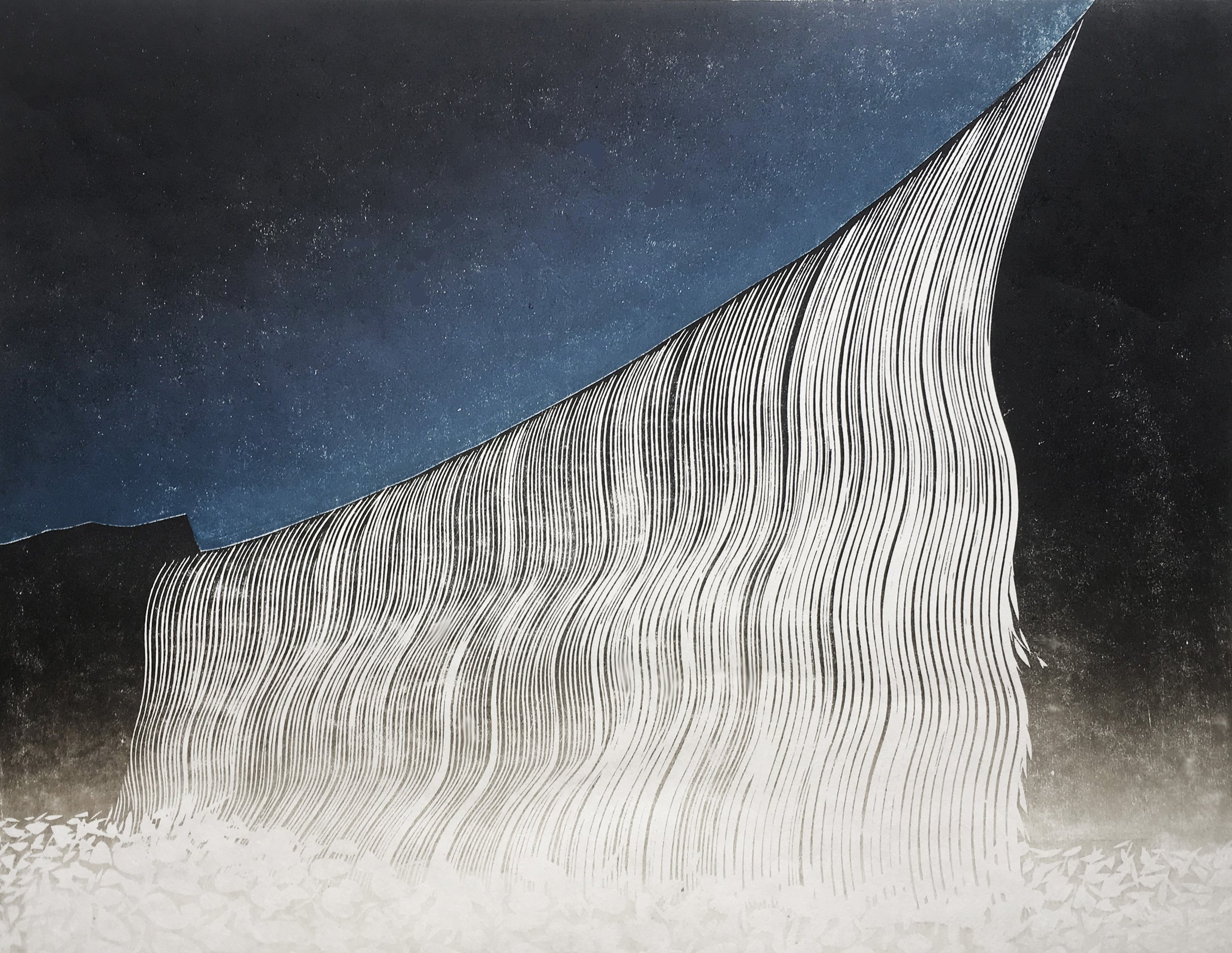
Night Falls 2019, woodblock print, 55 x 42 cm
“The lesson that I drew from Renoir is one I have to put in my own terms, even if this seems incorrect. I can’t find another way to express it. It is that ‘pure’ colour, whatever the hue, whatever the saturation, whatever the tone, is somehow boring compared with ‘impure’ colour.”
What cultural aspects of colour are built into your work?
The cultural context of my work is eclectic. I have studied work from several traditions and been influenced by one in particular in the work I have done in the past. My original impulse to work as a woodblock printmaker stems almost entirely from work that electrified me, by its daring, its scale, its beauty and its humour and humanity. All this work was by the great artist Shiko Munakata, and was carried out, in the main, in stark black and white.
Munakata also produced coloured work, which was carried out in an unusual way, by washing colour through the back of the very lightweight papers that he was using. The image itself would be printed in a virtually black ink. The ‘washed in’ colour gives a feeling of spontaneity but also of the ‘impurity’ which I have referred to earlier. Since this early influence, which stays with me to this day, I have come across ever more refined techniques for using colour with print and through practice and effort have mastered some of them. Technical mastery does not necessarily confer artistic success, but invariably creates options. There is a part of me that returns over and over again to the stark power of the black and white woodcut.

Tide Race, 2020, woodblock print, 89 x 39 cm
I have (with the fine woodblock artist Merlyn Chesterman RE) just completed a book entitled ‘Twenty Concepts in Woodblock Print’. This will be available from Crowood Press in April 2023. Here is the text of the chapter entitled ‘Colour’. It summarises our view of some aspects of its role in the art and craft of woodblock print. We did not think it appropriate in term of our book to go into the symbolic importance of colours – a field which several authors have far more understanding of than we do.
6 COLOUR
Colour occupies a comparable status in the visual arts to that which melody, harmony or rhythm enjoy in the composition of music – in all but black and white work, it has a central place. Just as in relationship to music, some people are very attuned whilst others have a ‘tin ear’ so it is with colour. For some people, there is a direct emotional effect driven by a whirl of associations catalysed by colour alone. The word synaesthesia describes how there is cross over of senses, so that sounds can have colour, or moods and vice versa. Whether it is a ‘condition’ or a gift, seems open to debate.
Colour sensitivity seems not directly proportionate to artistic ability, and some artists are relatively unaffected by colour. Theories in relation to the effect of colour upon emotion abound, and it is not hard to see why. It seems that colour really matters but it isn’t straightforward to carve ‘hard science’ from such a soft subject.
The terminology for management of colour in art is quite extensive and daunting. The printmaker will not simply have to contend with the realities of hue (i.e. what colour it is) and tone (i.e. how light or dark it is) but also with saturation, temperature, brightness, contrast and opacity. The skill of creating and selecting colour, mixing it, inking the block and printing it is equal to the artistic skill and judgement used when designing the subject of the print. As one builds layer of colour upon layer within a print, the permutations for success or failure rise exponentially. Some prints from the high period of Japanese printmaking of the nineteenth century require as many as 17 blocks to complete, each layer interacting with the layers below.
At its most extreme, the quest for colour perfection is a major part of making a successful print. The willingness to test and test one’s colour ambition almost to the bounds of endurance is a highly desirable quality. It seems that there is only one way to do this colour thing, and that is by hard graft.
The reward might be memorable work which enchants the eye and the soul.