
Ann Conrad Stewart

MOBO I, 2019, intaglio + relief print on Rives BFK, paper size: 39 ½” x 49", image size: 32”x 40”, 1/1. (photo credit: Steven Bates)
These large prints were created in 2019 over a several month period by printing multiple layers of four 16”x20” intaglio and relief plates in oil-based inks and various rotational orders; the pieces incorporate monotype and collagraph layers as well; the layering and varied process makes each piece unique though related to other pieces in the series by the common matrices.
“Many artists study something first in black and white in order to understand its structure through dark and light. I am the opposite. I study something through its range of color to understand its structure and to discover its elements of light and dark.”
Ann Conrad Stewart is a painter and printmaker living and working in Connecticut and Maine (USA). She currently prints at The Helen Frankenthaler Cottage at the Center for Contemporary Printmaking in Norwalk, CT. Ann’s approach to color is explorative and her approach to printmaking involves building layered, one-of-a-kind pieces through a set of common matrices.
Ann builds her printed images slowly, through multiple runs of plates through the press, using viscosity, à la poupée and intaglio inking. She works with intaglio, relief, collagraph and monotype printmaking techniques as well as additions of collage and hand coloring, and she also makes oil paintings and drawings.
Currently Ann is in the middle of a multi-year project “Mapping the Cliff Walk” at HM Contemporary in Scarborough, Maine. The first installment was presented in 2020 and the second installment opens in June of 2021.
Are there specific associations towards color in your work?
I am interested in exploring the full range and pushing the boundaries of a single dominant color within each work. I explore how various shades and overlays of a selected color can work with one another to create complexity and depth within each piece. Often the underlayers of a print begin with complimentary or contrasting color to the final layers. This technique enriches the final colors, and stencils are employed to allow the original layer and subsequent layers to punch through.
“Printmaking, usually considered a way for an artist to create multiples, ironically allows me to do just the opposite.”
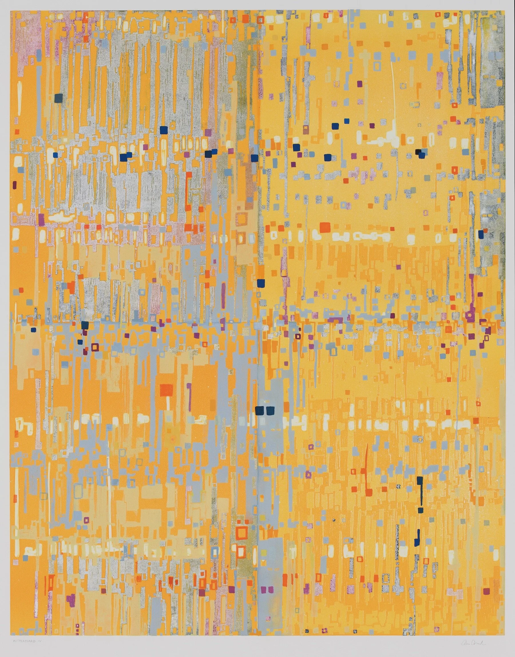
Motherboard IV, 2013, intaglio + relief print on Rives BFK, paper size: 39 ½” x 49", image size: 32”x 40”, 1/1. (photo credit: Steven Bates)
These large prints were created between 2013-14 by printing layers of 4 16”x20” intaglio and relief plates in oil-based inks and various rotational orders; some pieces incorporate monotype and collagraph layers as well as hand coloring; the process makes each piece unique though related to other pieces in a series by the common matrices.

MOBO IV, 2019, intaglio + relief print on Rives BFK, paper size: 39 ½” x 49", image size: 32”x 40”, 1/1. (photo credit: Steven Bates)
These large prints were created in 2019 over a several month period by printing multiple layers of four 16”x20” intaglio and relief plates in oil-based inks and various rotational orders; the pieces incorporate monotype and collagraph layers as well; the layering and varied process makes each piece unique though related to other pieces in the series by the common matrices.
Where do you reside between technical and intuitive in your work as an artist using color?
I am of two minds and impulses on this and bounce between the intuitive and technical in both printmaking and painting. I was taught traditional color theory in both high school and college and, at various times in my art education, I was not allowed to have black or white in my palette.
As a practicing adult artist, I feel liberated to begin a piece with a looser intuitive approach and a full color range of both etching and relief inks as well as various tint base extenders and oils. Once I get deep into the process of a multi-layered and multi-month print series, I usually find myself returning to my technical knowledge in order to resolve and finish each piece. When I leave the press at night, I affix post-it notes next to each drying print addressing what each one needs in order to push it forward towards completion with the next layer.
How does the printmaking process itself relate to how you work with color?
Printmaking, usually considered a way for an artist to create multiples, ironically allows me to do just the opposite. Within a series that uses a set of common plates, I am able to explore endless color possibilities while producing one-of-a-kind images.
Printmaking teaches me about color and color relationships every day–much like studying Joseph Albers’ Interaction of Color. Unlike oil painting, where many of the early layers of a finished piece are hidden within the painting itself, printmaking allows each stage (and consequently color interaction) of a particular piece to be recorded through progressive proofing. I take the many color lessons that I learn at the press back to the oil paintings and works in my studio.

MOBO VIII with a 4th layer ( à la poupée intaglio inking and Yupo stencils) going through the press

MOBO VIII, 2019, intaglio + relief print on Rives BFK, paper size: 39 ½” x 49", image size: 32”x 40”, 1/1. (photo credit: Steven Bates)
These large prints were created in 2019 over a several month period by printing multiple layers of four 16”x20” intaglio and relief plates in oil-based inks and various rotational orders; the pieces incorporate monotype and collagraph layers as well; the layering and varied process makes each piece unique though related to other pieces in the series by the common matrices.
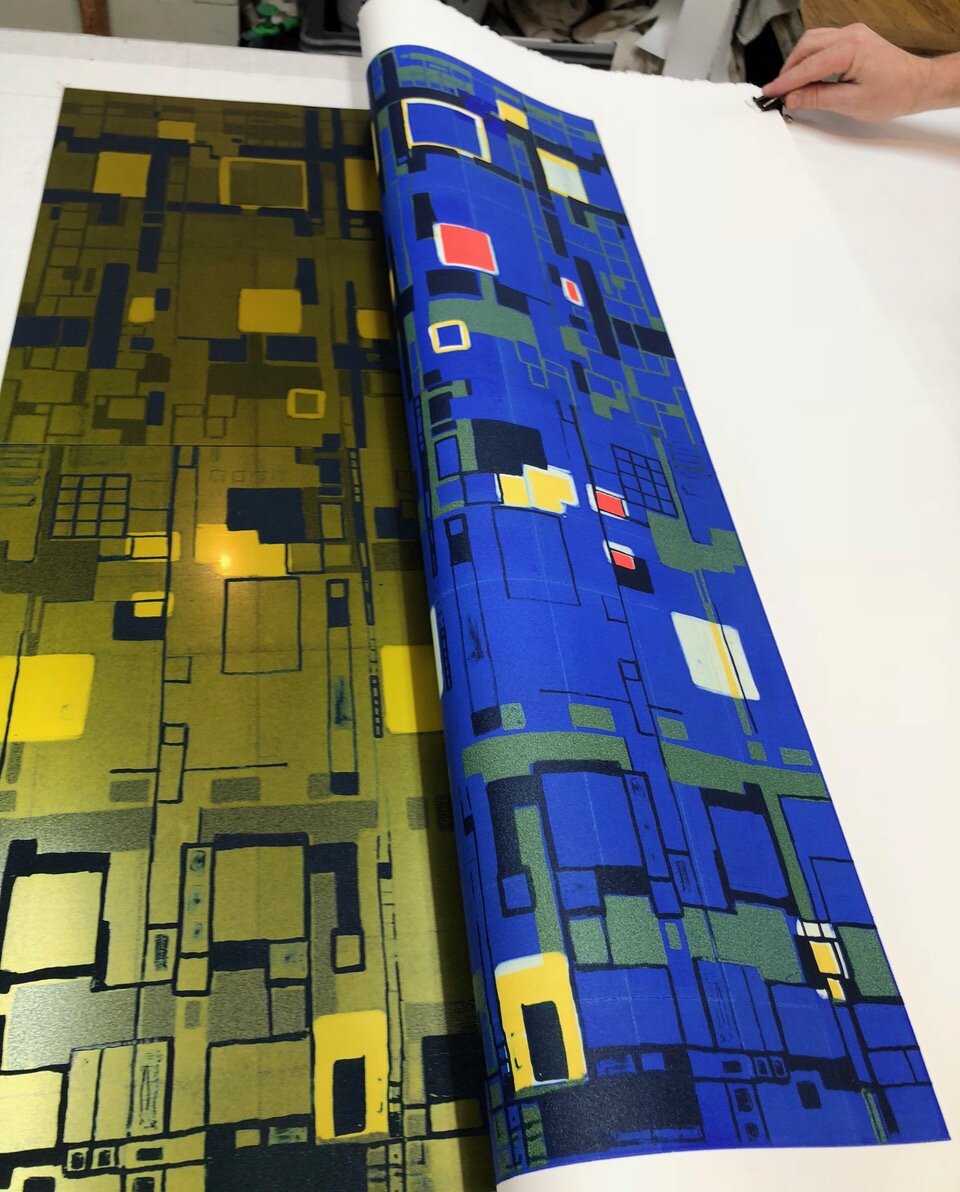
MOBO I with a final intaglio layer coming off the press with offset on the plates that became a ghost
What would your work be without color?
Color is essential to the way I experience, study and interpret the world around me. Fog…all white? I see cadmium yellow, lavender, rose, green, Payne’s grey and blue in all that white and discover its subtle lights, darks, warmth and coolness. Nighttime…all black? I see ochre, umber, turquoise, mauve, cyan and even titanium white in all that darkness.
Many artists study something first in black and white in order to understand its structure through dark and light. I am the opposite. I study something through its range of color to understand its structure and to discover its elements of light and dark
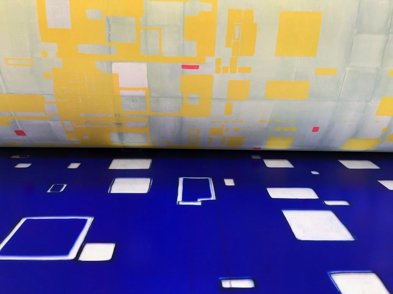
MOBO I on the press after three layers with a relief layer going down