
Laura Bigger

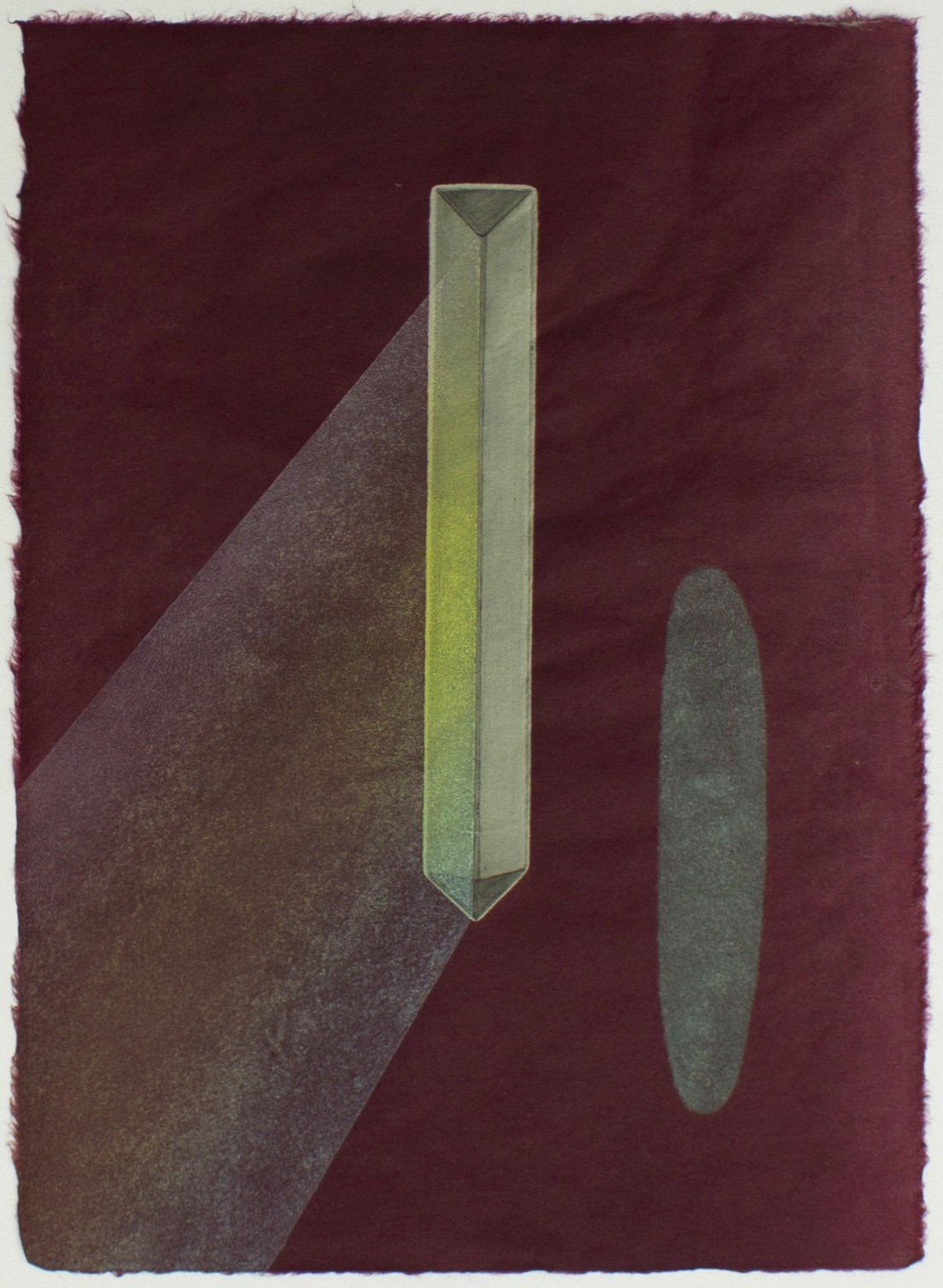
Bomb Pop, monoprint (intaglio, relief, silkscreen), 14 x 18," 2019
“The quality of a color is just as significant as the hue.”
Laura Bigger is an artist living and working in Kirksville, Missouri (USA). Her approach to color is associative, and her approach to printmaking is varied. Her symbolic, disorienting and surreal work is created with intaglio, relief, silkscreen and lithographic printmaking techniques.
Currently Laura is working on a series of monoprints that experiment with opposing elements such as light (reflection) and dark (absorption) to represent a range of metaphorical outcomes or pathways.
How does color represent or support the mind space of your work?
I use color associatively and symbolically in what I think are fairly intuitive ways. Color traveling through our vision accesses our emotions and artists have always understood this linkage to mood.
The quality of a color is just as significant as the hue. Changing value, opacity and gloss allows for subtle but meaningful changes in color. A transparent blue is so different from an opaque, creamy blue of a similar color.
In representing rays of light, transparent color has been essential to convey the way light affects its surroundings. I have also been juxtaposing actual reflectivity (by flocking reflective glass beads and using leafs or foils) as a way to make black ink seem even darker and absorbent by comparison. And I have been flocking velvet to achieve the opposite effect. The fuzzy surface sucks in the viewer’s gaze and confuses the eye. It’s harder to focus on soft edges.

Opposing Forces, monoprint (intaglio & silkscreen with reflective glass beads), 18 x 21," 2019
Sea Foam, monoprint (intaglio & relief with flocked velvet), 10.5 x 15,” 2019

Blue Ellipse, monoprint (intaglio & relief with acrylic and copper leaf on handmade denim paper), 10.5 x 15,” 2019

Reflection, monoprint (reduction woodcut, copper leaf), 18x25,” 2020
What can printmaking ink achieve regarding color in your work that no other material can?
Working with color in printmaking is distinct from all other forms of painting and drawing. I relate it the most to watercolor because of its thinness when printed and its transparency, but with printed color you can achieve rich darks, neons and shimmer in ways that watercolor is limited.
Like with watercolor glazing, through layering transparent colors, the resulting color is distinct from what you would achieve by simply mixing those two inks together. It emits a plurality, as though both original colors are present with a third color, whereas by mixing the two colors together the result is just one new color.
Printmaking also allows me to use color more literally. I can print a sheer white over a dark background and it really looks like a ray of light. Printmaking affords a level of control in regard to placement, detail, and layered color mixing. I value being able to lay down this variety of color I’ve just described in either a flat, even sheet or in highly detailed or selective imagery.

(detail) Reflection, monoprint (reduction woodcut, copper leaf), 18x25,” 2020
If you could eat a color for dinner, what color would you choose and how would it taste?
If I could eat a color for dinner it would be the translucent mid-value turquoise of clear ocean water on a sunny day as it increases in depth. It would taste light and juicy like a diluted lychee fruit, but with a fragile, slick, salty casing. The skin would burst with only the slightest pressure of the tongue against the roof of the mouth and dissolve too quickly, making you crave another bite.