
Rachel Livedalen

Set of 36, 2019, screenprint, gouache, and airbrush on panel, 40 x 30 inches.
“I’m especially drawn to printmaking and print media due to the reproducibility of not only the historic imagery but also the connection between image reproduction and power. I think a lot about how meaning is created and sustained through the reproducibility of an image.”
Rachel Livedalen is an artist living and working in Texas (USA). Her approach to color is referential and her approach to printmaking involves combining printmaking processes and methods with painting.
Rachel’s work references art history and pop culture and is created with screenprinting and stencil techniques, alongside airbrush and acrylic painting. Currently Rachel is working on a series of large-scale paintings for an upcoming exhibition at Erin Cluley Gallery in Dallas, Texas.
Are there specific associations towards color in your work?
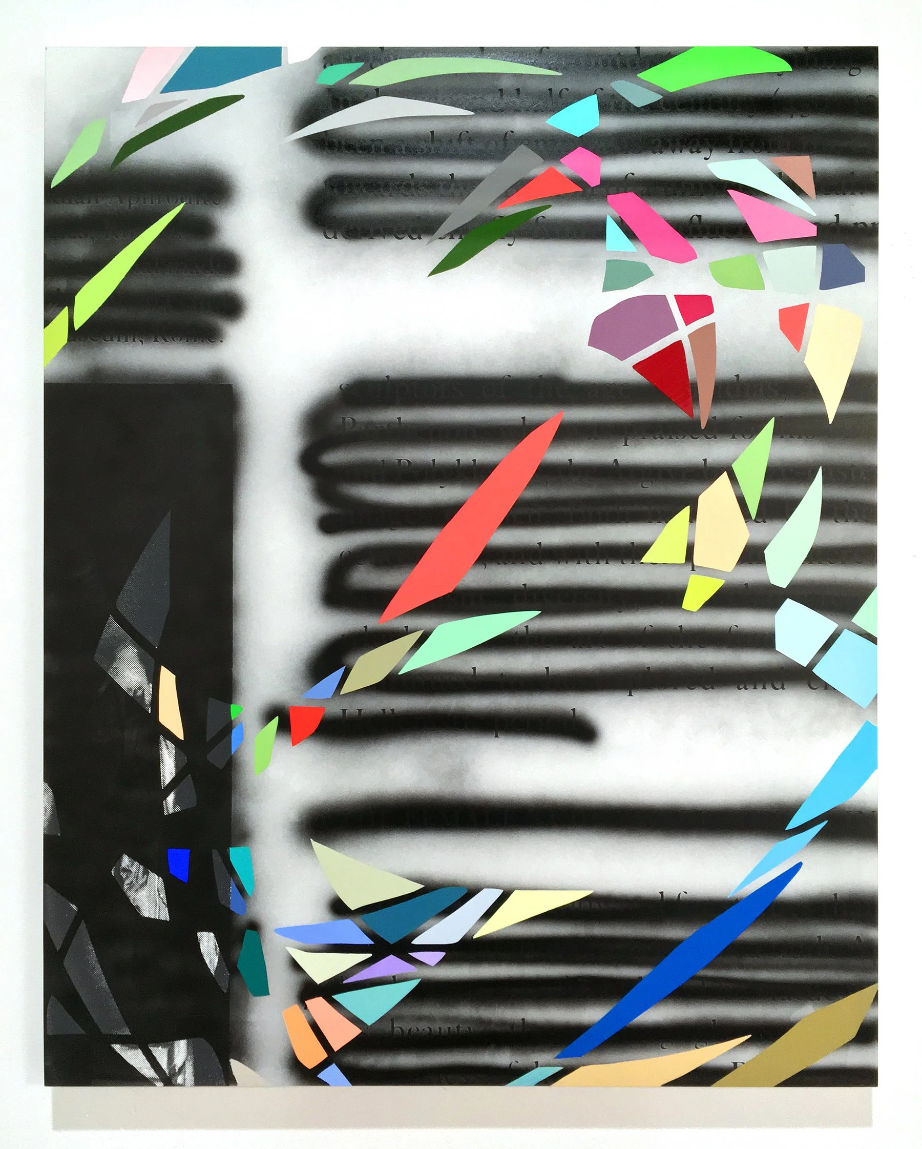
The core of my work is an analysis of feminine representation as reproduced throughout visual culture to better understand how perceptions of femininity have been constructed throughout history.
I’m especially drawn to printmaking and print media due to the reproducibility of not only the historic imagery but also the connection between image reproduction and power. I think a lot about how meaning is created and sustained through the reproducibility of an image.
My work over the last few years often takes Greco-Roman sculpture as a metaphor for the construction of the patriarchal western world and questions the artificiality, idealization, and romanticization of representations of women. On top of art historical images, I superimpose marks inspired by representations of contemporary “girl” culture by referencing cultural ephemera from my adolescence. These include Lisa Frank stickers, makeup palettes, or doodle-like drawings.
These references are especially present in the color of the work and sometimes the nod exists only through color or shape. Overall, there’s an inherent dichotomy within the work between time periods as well as high and low art.

Vain Attempts, Futile Endeavors, 2021, acrylic airbrush and screenprint on polycotton, 76 x 56 inches.

Activity Sets I - IV, 2018, screenprint, gouache, and airbrush on panel, each panel 36 x 24 inches. Installation view, Erin Cluley Gallery
“Clothing, textiles, book covers, album covers, nail polish, confetti, and trinkets can also serve as my color inspiration either directly or subtly. I would also be remiss if I did not mention how formative the color palette of Lisa Frank is to my work. I collect a lot of Lisa Frank stickers.”
What cultural aspects of color are built into your work?
When it comes to color, I often stick to the original color of the cultural objects and ephemera I’m referring to within the work. Sometimes this is a direct relationship. For instance, I’m drawn to the shape of cosmetic products like eyeshadow palettes and how they are similar to the shapes of amateur art supplies, like a watercolor palette. I’ll take a digital screenshot of a makeup palette and use illustrator to break it down to a set of specific colors. I then mix those colors and paint, airbrush, or print them usually in a similar organization to the original palette.
In other moments in the work, the color selection is somewhat intuitive but that intuition is generated through cultural references to consumer products. I think about how color is used commercially to make something desirable. I also think about how those desirable products are marketed in a way to engage with and reinforce cultural stereotypes about the product and its audience.
I usually keep printed ephemera like stickers and packaging in the studio as inspiration. Clothing, textiles, book covers, album covers, nail polish, confetti, and trinkets can also serve as my color inspiration either directly or subtly. I would also be remiss if I did not mention how formative the color palette of Lisa Frank is to my work. I collect a lot of Lisa Frank stickers.
There is also a strong contrast of black and white with color in my work. The black and white layer is usually appropriated from an art history textbook where it’s been reproduced in black and white. It is also connected with academic knowledge and history. Color and its pop cultural association is then layered on top. This combination reinforces the dichotomous relationship between the references.
How does the printmaking process itself relate to how you work with color?
Transparency. Screenprinting’s ability to quickly layer transparent colors in a flat and graphic way in combination with its ability to print photographic imagery is why I work with that process the most.
I also use screenprinting because I can easily combine it with painting. I paint like a printmaker in that I use stencils and mimic printmaking’s ability to work in layers. When working with stencils and airbrush, I am also able to achieve transparent layers of color as well as play with positive and negative shapes that the stencils create.
Page 56 Part III, 2019, screenprint, gouache, and airbrush on panel, 30 x 24 inches.