
Sam Hodge

Unfolding (Max Strength) 2022, 75 x 54 cm. Print from unfolded cardboard packaging, with ink made from earth pigments gathered in North Devon, on grey Somerset paper.
“Starting to take an interest in the materiality of pigments, has bought colour into my work.”
Sam Hodge is an artist living and working in London (United Kingdom). The colours she uses are often handmade and are carefully considered and full of associations. Her approach to printmaking is to work with what she finds to explore material transformations.
Sam Hodge is drawn to discarded human-made objects particularly those that have been transformed by processes such as weathering or accident into ambiguous and animated forms. Printing provides a way of responding directly to these objects by making impressions with them using relief printing, collagraph, softground, or photopolymer etching. She also likes to explore the power of materials and their transformations, finding patterns that echo those found in nature through experimenting with print processes such as monotype, aquatint with sugar lift/white ground and carborundum.
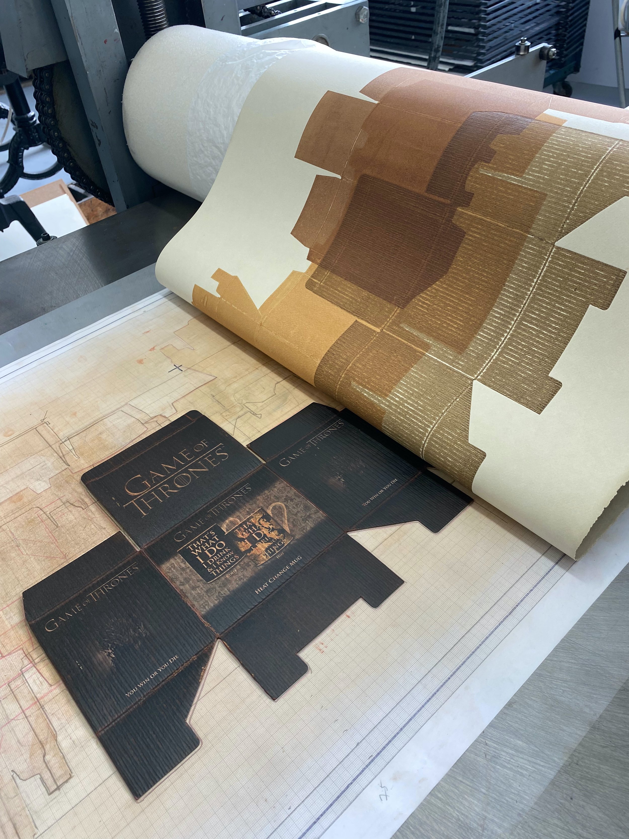
She is currently working on a series of relief prints made by rolling ink onto unfolded cardboard packaging boxes and printing directly from these. The ink is handmade with pigments ground from earths and rock collected from the shoreline on her walks around the coast of England.
Are there any specific associations that colours have in your work?
Working with pigments that I have found and prepared myself means that the colours are full of personal associations for me. I am engaged in a project to walk around the whole coast of England and Wales and eroded cliffs and beaches are a fruitful source of material that can be made into pigment. So, for me every colour is a reminder of particular places and walks and well as the deep time of geological processes that formed these earths and the cliffs they come from. Earths such as red and yellow ochres have a long association with humans. They were the first pigments to be used by people and are often endowed with symbolic meaning as a connection to the earth and its generative power.
Making the earth into pigments is a time-consuming process of grinding, soaking and sieving to transform the earth into a fine powder. To make relief ink for printing the unfolded boxes, I mix the pigment with relief oil and grind with a muller on a glass slab until it is smooth. Memory of this labour, this physical encounter with hard rock or gritty earth is also there as an association in the final colours.
By the time I have finished all this work I am really excited to find out how the colour will come out on the paper. Mixing with oil makes the colour richer and more transparent than it appears as a pigment so sometimes this is quite a surprise. These earthy colours seem appropriate for printing from boxes. They hint at the brown cardboard that the boxes are made of. Like the boxes, they are found by chance and transformed by their contact with me.

Processing ink in Sam Hodge’s studio

Unfolding (I Know Things), 2022, 75 x 54 cm. Print from unfolded cardboard packaging, with ink made from earth pigments, on grey Somerset paper.

Unfolding (Everyday Magic), 2022, 54 x 37cm. Print from unfolded cardboard packaging, with ink made from earth pigments on grey Somerset paper.
“These earthy colours seem appropriate for printing from boxes. They hint at the brown cardboard that the boxes are made of. Like the boxes, they are found by chance and transformed by their contact with me. ”
Work in process in Sam Hodge’s studio
Where do you reside between technical and intuitive in your work as an artist using colour?
I was trained and worked for many years as a painting conservator, which has left me with a great interest in materials and the technical aspects of making art, but I also believe intuition is a vital part of making any artwork.
I love bright colour and enjoy the way that colours interact with each other, but find it difficult to use ‘arbitrary’ colours in my own work. For me, there has to be a reason to select particular colours. As a result, in my printmaking I have often avoided colour and instead explored the deep blacks that etching inks give or experimented with white ink on black paper, making work that is more about texture and contrast than colour.
Starting to take an interest in the materiality of pigments, has bought colour into my work. Making my own pigments from found materials and then making these into inks requires a lot of technical knowledge and practice. It also depends on the serendipity of finding, which is a limitation. I can only use the colours I have found and prepared. I cannot just decide to buy purple ink one day and see how it works with iridescent green. Paradoxically this has released me from the tyranny of too much choice and allowed me to then play intuitively with the colours I have found. I try colour combinations and overlaps to see what these ochre inks can do and how they relate to each other.
How does the printmaking process relate to how you work with colour?
In these unfolded box prints, the process enables me to use the colours in ways that would be quite difficult to achieve in painting. The inks are fairly transparent. I add a little extending medium to them to increase transparency, but the natural earths are semi- transparent pigments to begin with. The process of rolling ink onto the flattened boxes means that a relatively even layer can be achieved even with a transparent ink. This is difficult to achieve in painting.
I run the different unfolded packets though the press one after the other so that the colours overlap. The transparency of the ink means that the layers underneath show through those on top, producing new colour mixtures where there are overlaps. I spend a while making a template on squared paper so that I know where to place the packets. Lots of playing around placing unfolded packets and several print trials are necessary to get compositions that really work. The printing process means that I can adjust as I go along, trying out different colours until I have something that pleases me. My edition sizes are small – usually an edition of 3 in a certain set of colours. Sometimes I use the same template with a different set of colours to produce a second edition, but there is a limit to the number of prints you can make as the boxes begin to disintegrate after about 10 prints.
The warm grey paper in my series of unfolded box prints sets off the hot, earthy colours and softens them and reduces contrast, helping to minimize slight faults in the rolling that occur because of the unevenness of the boxes. I like some of this texture, which carries the nature of the box into the print, but I don’t want it to dominate too much, as it might if I was using stark white paper.
I am really enjoying the surprises I get from new combinations of boxes and new colours and plan to continue making these prints for a while. It is satisfying to make with things that would otherwise be thrown away without being noticed. I love the seemingly endless variety of shapes that you find in unfolded boxes and look forward to making more traces of them with earth from beneath my feet.

Unfolding (Just Do It), 2022, 75 x 54 cm. Print from unfolded cardboard packaging, with ink made from earth pigments on grey Somerset paper.