
Cameron York

Blue Line, 2022, 13 x 10 inches, intaglio and mixed media.
“ I like to draw people into my prints with a familiar cartoon colored palette, and then let the slow burn of imagery take over.”
Cameron York is an artist living and working in Portland, Oregon (USA). Her approach to color is bold and her approach to printmaking is vibrant and ever-evolving. Cameron’s multi-layered and bright works are created with intaglio, monotype and hand-worked media. Currently she is preparing for a solo exhibition at NeuHaus Press, two portfolio exchanges and learning how to incorporate woodcut into her prints.
How does color represent or support the mind space of your work?
I deal with topics in my work that are heavy or have a dark edge, but I make them enticing with my use of bright candy colors. I like to draw people into my prints with a familiar cartoon colored palette, and then let the slow burn of imagery take over.
This is how I see the world, I think. There is much that is bright and beautiful. I don’t immediately see all the darkness, but if I look at humanity long enough I sure see it. The mind space of my work is ultimately the mind space of myself. What I create is a chunk of my being.

Blink, 2022, 12 x 10 inches, intaglio and mixed media.
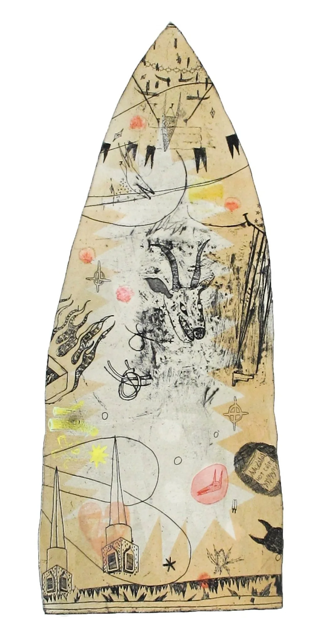
Hot Chips, 2022, 22 x 15 inches, intaglio and mixed media.
“It is most important for me to leave room for whimsy when I’m working. Whimsy is anything that happens that you weren’t expecting. More room for whimsy means less room for disappointment.”
Where do you reside between technical and intuitive in your work as an artist using color?
I start planning a print by doodling ideas in my sketchbook and filling the margins with notes to myself about how I want to etch certain areas of my plate, what shape I want my plate to be, and probably a to do list of shit I need to do before I can get around to making this print. After drawing and scribbling notes I can dive into working on my plate.
These days that looks like rifling through my copper plate drawer in my flatfiles and finding the perfect previously etched plate for me to recycle. This is where intuitive play begins. I will scrape and dremel and burnish to my heart’s content, usually leaving behind a bit of old imagery and some labor marks. Once the plate looks and feels right to me I will coat it with hardground.
Cultivating my ability to trust myself during this process took years, but it brings me a lot of wonder and joy. I highly suggest trusting yourself and the process. At this point, I loosely draw my imagery onto my hardground plate with a sharpie, and then start working the lines into the ground with an etching needle. When I am satisfied with my marks I’ll etch my plate. I don’t have a length of time I always etch my plates for, but these days it’s an hour and a half. It feels right and gives me a bangin’ line.
When I am ready to print, I nearly always fall back on printing my line work in a blue-black. I find that mixing blue into my black ink gives the imagery more depth and is more interesting to look at. I’ll also mix red into black which warms it up, but blue-black is my favorite.
I check on how blue my ink is by doing a draw down on a scrap of paper. If the black has a cool glow to it then its ready to rumble! I tend to always print my line work in a version of black because it will remain a strong color even with layers of transparent color on top of it. It’s a bit of a balancing act, I suppose.
I wait a couple days between printing my lines and printing my layers of color; I want my lines to be dry so they don’t squish when I run the paper through the press again. When I’m ready for color layers my intuition takes over. I solely print edition variables because making the same print over and over again has never interested me. My plates have several lives to live and several color combos to print.
I will put inks down on the slab like its a painters palette and start mixing. I know I am going to make each color transparent so that’s in the back of my mind as I work (I like Gamblin’s transparent base). Here is where I will divulge a couple of my print secrets to you, dear reader.
I use newsprint for my stencils every time because, 1) It’s fast and easy to cut shapes out of and, 2) It does this fun thing where after you have printed a color layer with the stencils between your plate and printmaking paper, the next color layer that gets rolled onto the plate sits differently on the area of the plate where the newsprint stencil was.
But, to achieve that, you have to Chase the Rainbow. That means you can’t clean the ink off your plate after you print a color layer. Just roll up again and keep printing. Sounds wild, huh? Maybe you should try it. Anyway, the next secret I’ll tell ya is that when I’m printing my color layers I’m monotyping off my plate so the orientation of pressbed, plate, paper, blankets, can actually be pressbed, paper, plate, blankets, that way your registration is tight every time. Print upside down! It’s fun I promise!
So, my entire print process is intuitive, but supported by my technical knowledge and deep love for really specific print methods. It is most important for me to leave room for whimsy when I’m working. Whimsy is anything that happens that you weren’t expecting. More room for whimsy means less room for disappointment.
“...I nearly always fall back on printing my line work in a blue-black. I find that mixing blue into my black ink gives the imagery more depth and is more interesting to look at.”
What color do you wish you could buy?
Pink! Every shade of pink! Pink invigorates me, it inspires me, and creeps into nearly every piece I make. When I look at pink I feel good!
And really, it’s that simple. Looking at pink gives me a feeling of happiness and for that reason I’ve surrounded myself with a lot of pink. Have you tried pink yet?

Hell or High Water, 2022, 10 x 8 inches, intaglio and mixed media.