
Sean P. Morrissey
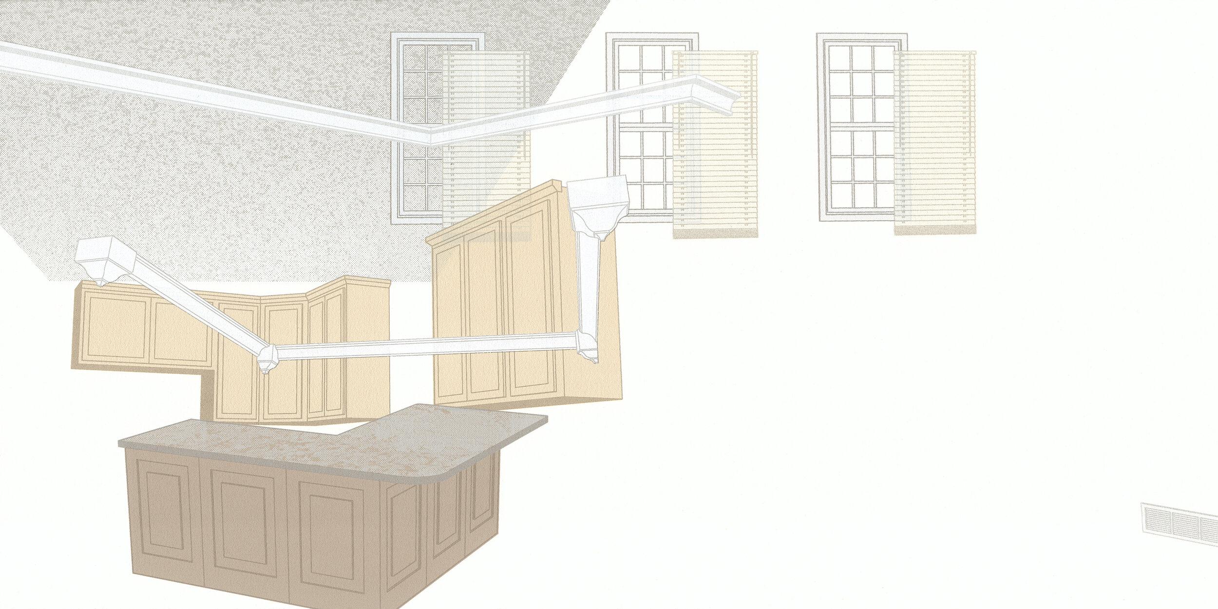
Pile #11 (Terrestrial), 2020, screenprint on Rives BFK, 20 in. x 10 in.
“Color serves to denote what I am referencing conceptually and allows me to be as true to my environments as possible.”
Sean P. Morrissey is an artist living and working in Fayetteville, Arkansas (USA). Their approach to color is observational and their approach to printmaking is broad. Sean’s critical and research-based work is created with a variety of reproducible media, along with 3D modeling, collage, drawing and painting. Currently, they are developing a body of work for the exhibition Tiny roads that lead to nowhere, with Lenore Thomas, that pairs analog and digital print methods as framed works and takeaways.
Are there specific associations towards color in your work?
The suburban North American landscape and lifestyle serves as the foundation for my investigation into domestic space, land use, and consumerism. As someone who will most likely not see personal homeownership due to educational debt and no generational wealth, I look toward these evolving spaces and their architectures to create work.
The long history of the “Dream Home” is the primary focus of my research and is the starting point for questioning the role of these idealized spaces today. The display of identity through our personal space is ironically achieved via calculated design choices made in boardrooms, pre-mixed and predetermined color palettes licensed by millionaire interior designers, and other controlled options. These superficial design elements are limited to a select group of architectural embellishments that become a standard for housing developments.
The over-production of this visual vocabulary has become so commonplace that it is both the architectural standard for many communities and the only option for new homeownership. These motifs have formed the new natural landscape. I want to examine our simultaneous desire to fit in and stand out while I question my own desires, paths to self-determination, and individuality.

Pile #12 (Celestial), 2020, screenprint on Rives BFK, 20 in. x 10 in.
“Using color that is taken literally from the shelves of endless swatches, I pair them with imagery from domestic spaces to further acknowledge the absurdity of identity through predetermination.”

Pile #17 (Zillow), 2020, pochoir on Rives BFK, 14 in. x 11 in.
How does the printmaking process itself relate to how you work with color?
These are closely tied together as I think about color through the process of printmaking itself. Most often, this takes the form of striving for total “flatness” to mimic cartographic design or building up layers of transparent ink to develop moments of depth and illusion. The immediacy that a process like screenprinting can afford me while selecting color is also extremely important. I can pivot to using latex paints mixed at hardware stores to further drive both the technical and conceptual aspects of the work.
Print processes allow me to render my imagery as accurately as possible, including color, whether that be a shadow on a brick wall or a specific beige vinyl siding. It also mimics the physical presence of things like shadows and highlights, allowing for a more accurate depiction of the built environment. Color serves to denote what I am referencing conceptually and allows me to be as true to my environments as possible.
What cultural aspects of color are built into your work?
We are often told that we have a choice in decorating our homes, in making them reflect who we truly are. However, the calculated design decisions, such as preplanned color palettes, leave us with no unique choices. I examine these norms and values around color choices that have been established through home improvement television, hardware store advertising, and do-it-yourself-weekend-project culture to address this lack of individuality.
Using color that is taken literally from the shelves of endless swatches, I pair them with imagery from domestic spaces to further acknowledge the absurdity of identity through predetermination. The colors I ultimately select for my work stem from my experiences observing people painstakingly choose between multiple shades of a color, the names that colors are assigned (“Cloudless Sky” is forever a favorite), and the vast menus for home personalization that custom home builders provide to eager buyers.

Pile #20 (Zillow), 2020, pochoir on Rives BFK, 14 in. x 11 in.