Tony Curran
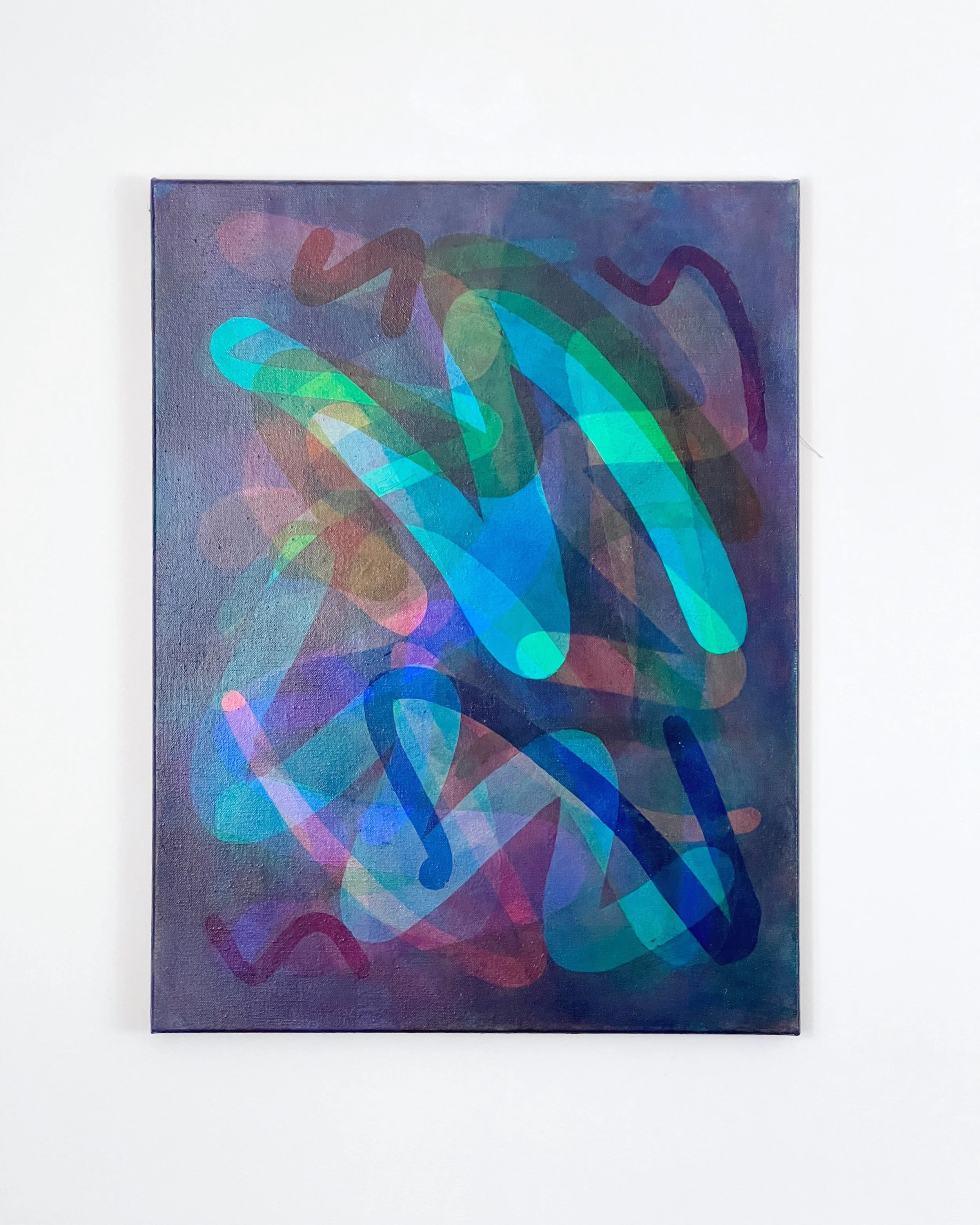
Chromatic Attention Machine #9 (Gen 2), Acrylic on linen, 87 x 67 x 4 cm
“The push-pull keeps the viewer searching for more visual cues to get to the bottom of the work.”
Tony Curran is an artist living and working in Launceston, Iutruwita (Tasmania, Australia). In Iutruwita (Tasmania), Tony is part of a print collective named No(where). The artists in this group reflect on the unique place that is the island on which they live.
Tony’s approach to color is analytical and exuberant, and he approaches printmaking as an outsider. Tony’s works are created with etching, stenciling, screenprinting, and lithography techniques, and he also works with painting and drawing.
Recently, Tony has focused on his series Attention Machines, stenciled acrylic paintings on linen that provoke both pleasure and puzzlement through difficult-to-trace, quasi-mythical abstractions of color and shape. These works employ a color system of red, green, cyan, magenta, and yellow, echoing both color theory and creative code, and going beyond a simply playful approach to color. Tony says, “I want to show the dignity of a rainbow.”
How did you first learn about color?
I first came to really understand colour when I was making digital prints form iPad sketches. What I didn't realise then was that I'd accidentally converted my file into CMYK colour which reduced the gamut. In frustration (and falsely blaming the printing) I decided to paint my digital sketches, meticulously mixing the screen colour on my palette until I had a perfect match, and then translated it onto the surface - usually canvas. That intense practice helped me to understand how complex colour was.
A small shift in digital colour or RGB value meant a distinctly different feel in the overall composition. A printmaker named Ben Rak saw me working while I was on a residency and invited me to do a print collab with his Throwdown Press. I learned about process CMYK screenprinting and using halftone dots as visual texture in tandem with the opticality of colour overlays. I was hooked and before I knew it was collaborating with Cicada Press, making etchings with Michael Kempson.
The processes of thinking through colour with etching plates led to the visual forms that I currently work with, and forced me to lean heavily into transparent overlays of colour. As a painter, the range of colours available are immense, but printmaking inks, at least in Australia are a much narrower range, that committing to a palette - such as process CMYK, has cultural baggage, through ties to industry mass-media print and intriguingly these colours are the complementary opposites to the pixel that transmits mass-media today. So an approach to colour reflects its cultural position, and my cultural position is somewhere at the intersection of digital and material.
“Colour is dazzling and helps to confuse the viewer just enough from a coherent understanding of what they’re looking at and how it’s constructed.”
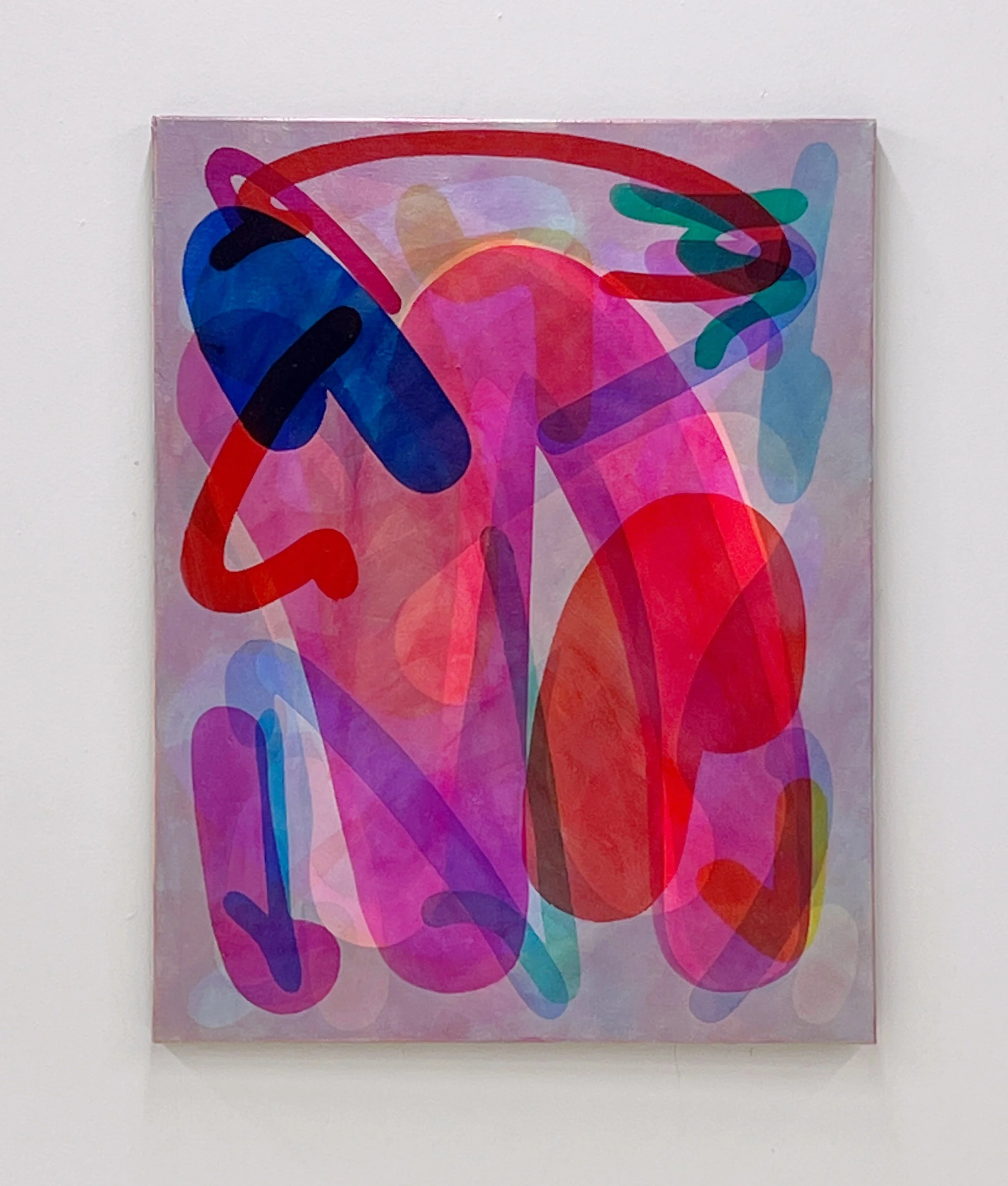
Chromatic Attention Machine #30 (Gen 4), Acrylic on linen, 97 x 76.5 x 4 cm
Are there specific associations toward color in your work?
I'm interested in how screen colour is used to seduce users into habits of inputting personal data and consuming media - but also how the fine arts traditionally work with material colour, which offers very different opportunities and densities, that can saturate the retina in situ.
All of this has led me to secure funding with some collaborators on the idea of Artworks as Antidotes - if formal elements can shape behaviour and attention, can they help or heal society?
Where do you reside between technical and intuitive in your work as an artist using color?
A big part of my interest in the type of work that I make is the tension between systems and freedom. There's a strong history of gestural mark-making being a symbol of artistic freedom, and more recently, the so-called 'mediated mark' has become a compelling paradox of mechanical precision that expresses human agency.
I have processes that invite intuitive mark-making where I can create databases of intuitive feeling and, hopefully, graceful shapes that I can use to convey the spirit of intuition, even if the sharp edges look calculated and technical.
I'm also a big fan of the glitch. I have a tendency to over-define my work, conceptually and technically, and it's often a corrupting element that saves the work. Sometimes that's a collaborator, but other times it's a quirk of the technology or material that hits me for six.
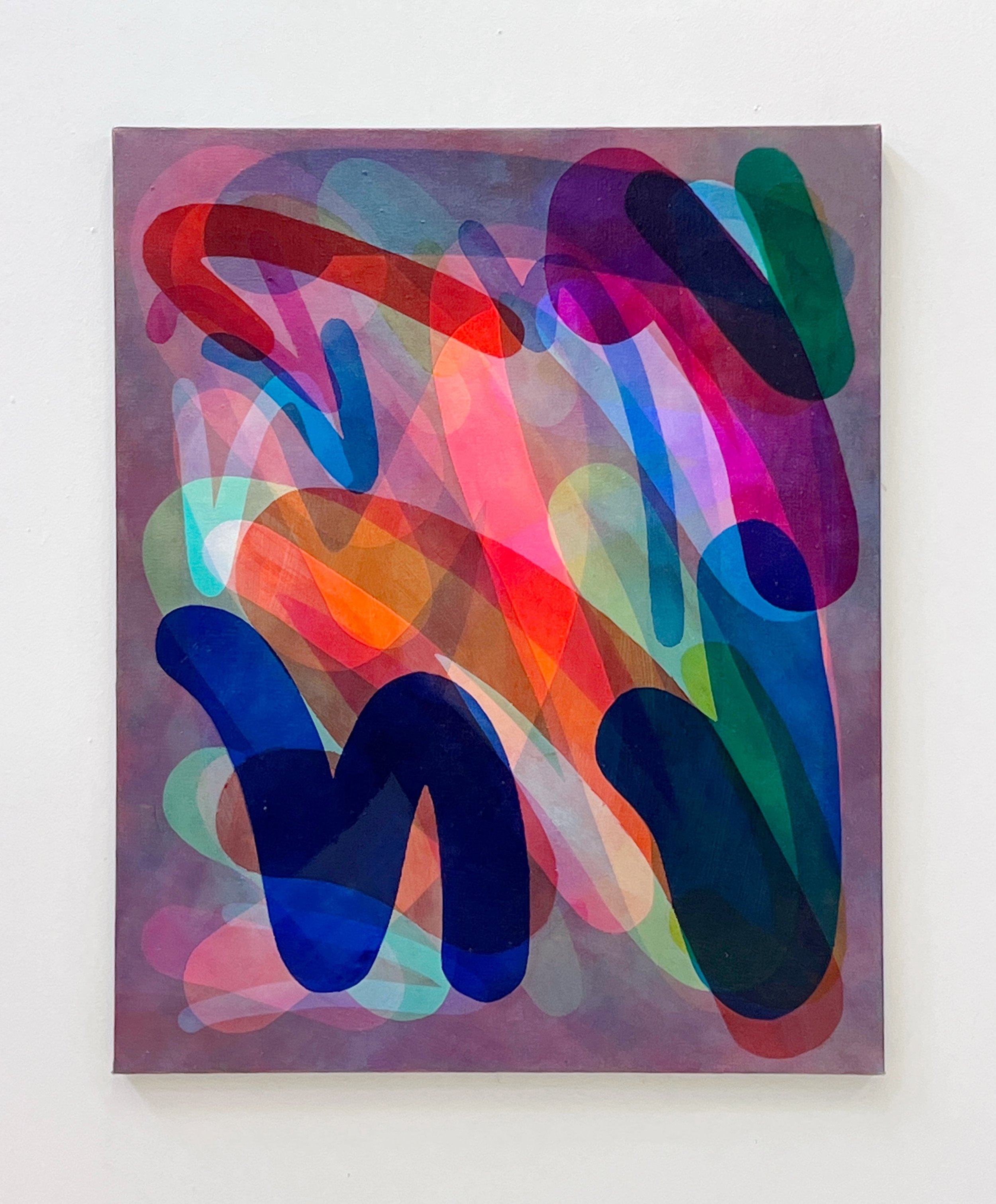
Chromatic Attention Machine #29 (Gen 4), Acrylic on linen, 102 x 83 x 4 cm
“It’s around getting complexity with strategically limited ingredients.”
How does the printmaking process itself relate to how you work with color?
It's around getting complexity with strategically limited ingredients. When making editions with Cicada Press, I wanted to give the illusion of flat overlapping and opaque colours - something that worked well with my experience in screenprinting. I realised, with the coaching of Cicada Press, that it was using the etching process against itself, and that I should try to dance with the process rather than negate it. So, I decided to use their advice and have transparent overlapping shapes. Now, everything I make is a descendant of those colour processes.
My code-based works became animated versions of the prints I made with Cicada Press, and I made paintings that mimicked the overlapping colour interactions before figuring out the best way to adapt painting processes to get that colour magic. The result is a print-painting hybrid using stencils. While it's not press-based, it uses a matrix. More recently, I've been exploring CNC routing to make arrays of stencils that can be intermixed across different paintings and then used as large woodblock plates.
How does color represent or support the mind space of your work?
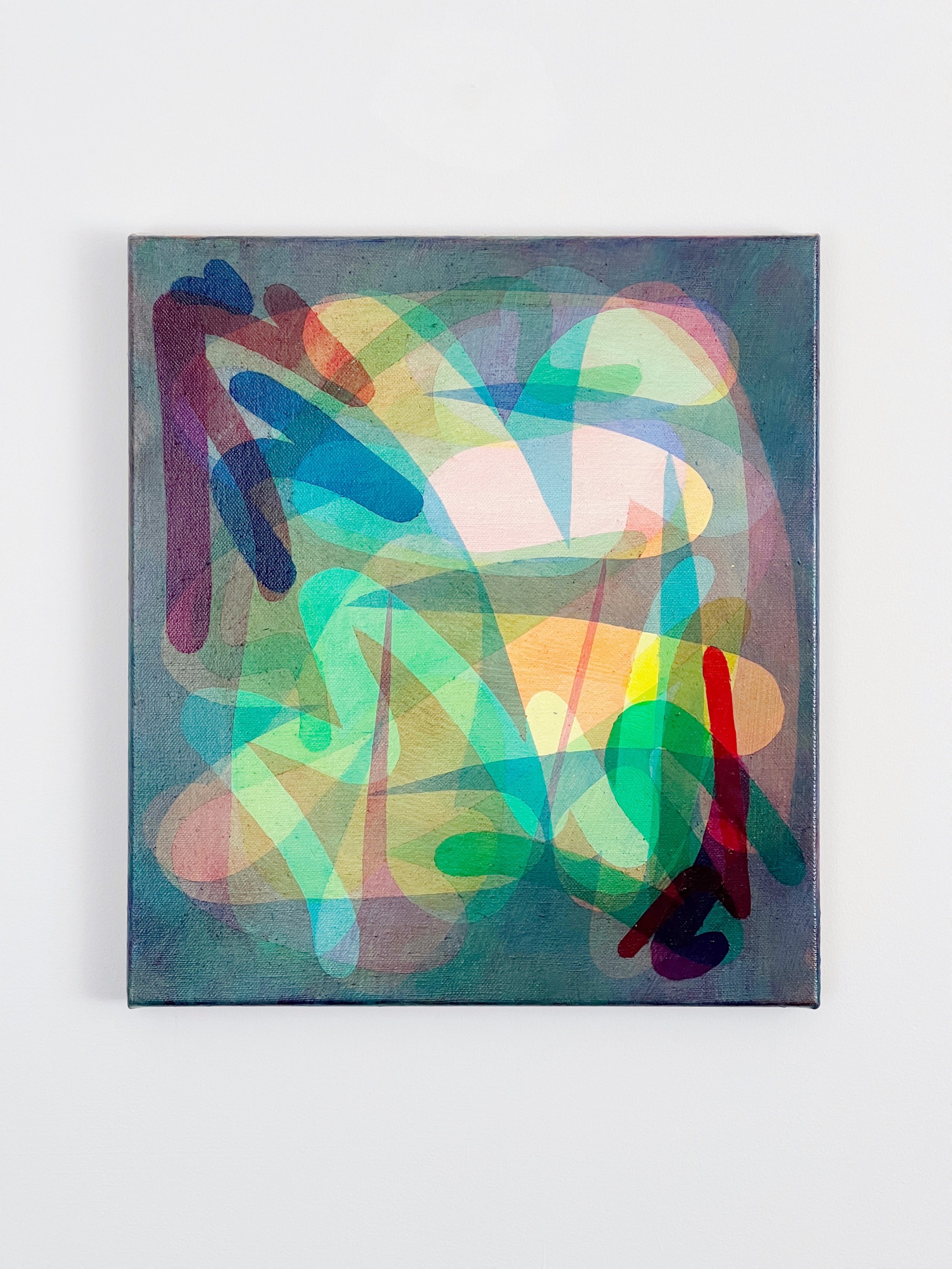
Colour defines everything in my work. Tone and light are created through layers of a narrow selection of very bright, primary pigments. That means that darkness is created by rich overlays of bright colour. The pigments I choose are transparent and I try to make it impossible to determine which order the colour layers have been applied, helping them to fuse at the same depth of the picture plane.
The layers are made, for example as a uniform ground of transparent colour with positive and negative shapes of that same colour. I.e., a layer might include an evenly spread of yellow-saturated floating forms with either a higher or lower saturation of yellow. As the colour layers combine, it becomes hard to distinguish what colour those marks are, and on what layer. As marks overlap, the negative forms shine brighter, appearing more colourful when they are actually more of an absence of colour.
This effect can be puzzling. Combined with the serpentine lines and biomorphic blobs, the work aims at a push-pull of pictorial space, where negative shapes advance and positive shapes seem to recede into the depths. The push-pull keeps the viewer searching for more visual cues to get to the bottom of' the work. Colour is dazzling and helps to confuse the viewer just enough from a coherent understanding of what they're looking at and how it's constructed.
Chromatic Attention Machine #19 (Gen 3), Acrylic on linen, 51.5 x 46 cm


