
Mark Hosford

Blue Memento Mori 2, 2017, 12.5" x 12.5"
“I often wonder why I am attracted to print as the best vehicle for working in color. Perhaps it is because of how I consumed imagery as a child. All of the graphics I was drawn to were printed with ink.”
Mark Hosford is an artist living and working in Nashville, Tennessee (USA). His approach to color is intuitive, and he is a glutton for punishment in his approach to printmaking. Mark’s playful, curious, and mystical work is created with screenprinting and relief printmaking techniques. His work is mostly drawing-based, and he occasionally works with animation and other materialistic flights of fancy.
Currently, Mark is working on more drawings. He has a sabbatical a little over a year from now, so he is hoping to focus on a lot of new work at that time. Mark will be in a couple of exhibitions very soon. One will be for the Tennessee Triennial. Another will be a two-person show in October at LeMieux Galleries in New Orleans, Louisiana (USA).
Are there specific associations towards color in your work?
When I am in search of color inspirations, I often look at vintage products and graphics. I am interested in how color has been used throughout different decades. In some periods, the trends leaned towards deep and muted colors, while in other, they preferred bright or pastel colors.
I try to take note of these color combinations and experiment with them in my prints. I am especially interested in how different color inspirations can change the mood within my prints. If a print might contain intense imagery, I may choose to use soft pastels as a juxtaposition. I enjoy how these color inspirations may harken back to particular decades that share those color trends.

The Scout II, 2018, Screenprint, 21" x 21"

He-La, 2013, Screenprint, 28" x 22"
“The analytical side of my brain seems to love thinking about color as a process of building blocks like resemble a math problem, a way to have multiple steps that require an inherent logic in order to create a solution. Color makes more sense to me when I work with it within the context of a print.”
How does the printmaking process itself relate to how you work with color?
I often wonder why I am attracted to print as the best vehicle for working in color. Perhaps it is because of how I consumed imagery as a child. All of the graphics I was drawn to were printed with ink. The came in the form of cheap comics, t-shirt graphics, vinyl record covers, wacky cereal boxes, skateboard graphics, and stickers, along with a never ending stream of printed ephemera. When I juxtapose these influences alongside the things I thought I excelled at in school; drawing and math, it sort of makes sense. The analytical side of my brain seems to love thinking about color as a process of building blocks that resemble a math problem, a way to have multiple steps that require an inherent logic in order to create a solution. Color makes more sense to me when I work with it within the context of a print.
When working on a new print, I am forced to slow down and think about every single color I will use. I not only contemplate which colors to use, but also how many color runs I need to incorporate. I prefer mixing spot colors rather than utilizing a CMYK separation, even though this adds more time and materials. By printing each color individually without overlapping translucency, I allow myself a tremendous amount of control for how all the colors will turn out. As I build up an image, I ask myself how many colors a print will need in order to be complete. I try to remove runs that feel superfluous to the image. Every print will dictate the amount of color runs it needs, and that is how many it will get.
I have been working in screenprint for a little over two decades now. I am drawn to how this process allows me to utilize highly saturated colors with remarkable consistency over the surface area on the paper. Screenprint also allows a more economical method of printing when large amounts of color runs are needed. Being able to reuse a screen over and over again makes additional color runs much more efficient.
There is just a unique beauty that is singular to screenprint ink for me. It sits both in and on top of the paper to get a bold punch of true color. It is strangely satisfying to mix water-based screenprint ink. It’s like making new flavors of yoghurt or candy since I mix it in food containers with baking spatulas. There have been a few times when I was working without much sleep and I caught myself almost going for a taste when mixing ink. It just looks that delicious!
Where do you reside between technical and intuitive in your work as an artist using color?
In my work, I try to maintain an even balance between technical and intuitive ways of approaching color. Despite this, the scale always tips towards intuitive for me. Regardless of how I actively apply color theory principles, it seems that only gets me so far. At some point, every image dictates the need for its own unique color scheme that follows its unique emotional logic. As a print gets developed, my instinct of what colors will work changes. It is rare that I finish a print that maintains the original color scheme that it started with.
The ability to create color proofs and trials on the computer has really changed the way I work with color. It is not unusual for my screenprints to employ 15-25 color runs. Because of this, I find it too time consuming to print a physical proof before I edition. I prefer to work it all out on the computer first, and then edition the print matching the color scheme I worked out virtually. In order to best match the colors on the screen, I print out my colors on a sheet of color swatches and mix the inks to match the printed swatch. I enjoy seeing how close I can get to the printed target.
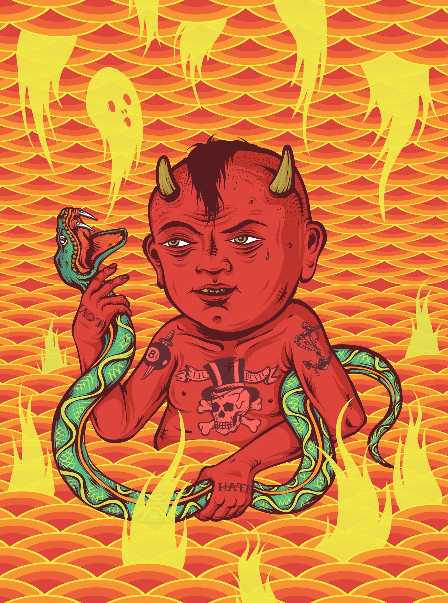
Lil' Devil, 2016, Screenprint, 35" x 26"
Attachment 1, 2016, Screenprint, 37" x 26"
Drawing digitally also allows me to keep aside different color schemes of the same image so I can compare and contrast different versions in order to see which I find works best with the particular subject matter. On some occasions, I can’t decide which version is more successful and I edition more than one version. I am fascinated with how color can alter the reading of an image.
One of the things that I love about color is how it is how relational it is. As we know from studying the works of Joseph Albers, colors are perceived differently when they react to all other colors in direct proximity to each other. If I change one color in a print, it often sets off a domino effect where every color used may need to change with it in order to harmonize them again.
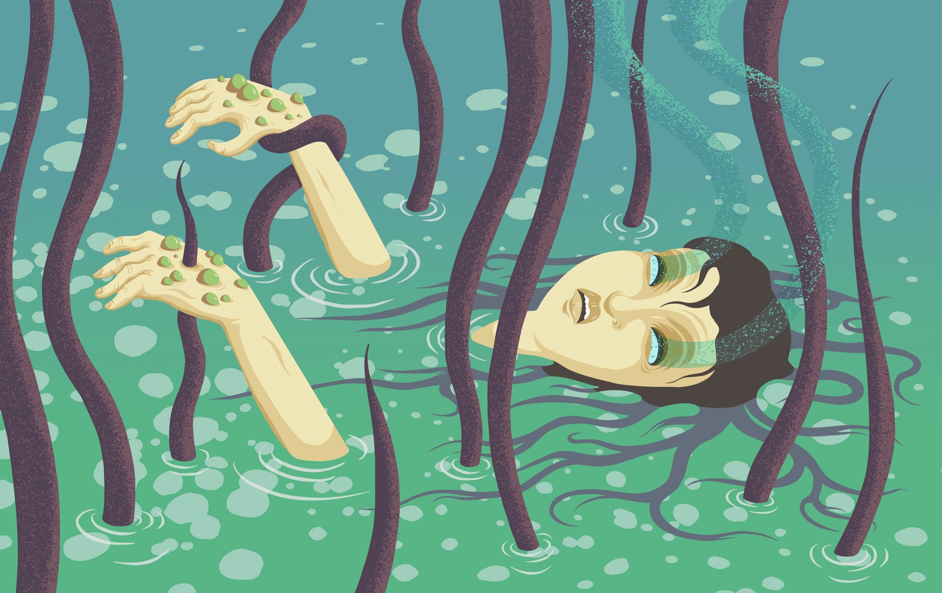
Undine, 2020, Screenprint, 20" x 32"
“I prefer mixing spot colors rather than utilizing a CMYK separation, even though this adds more time and materials. By printing each color individually without overlapping translucency, I allow myself a tremendous amount of control for how all the colors will turn out.”
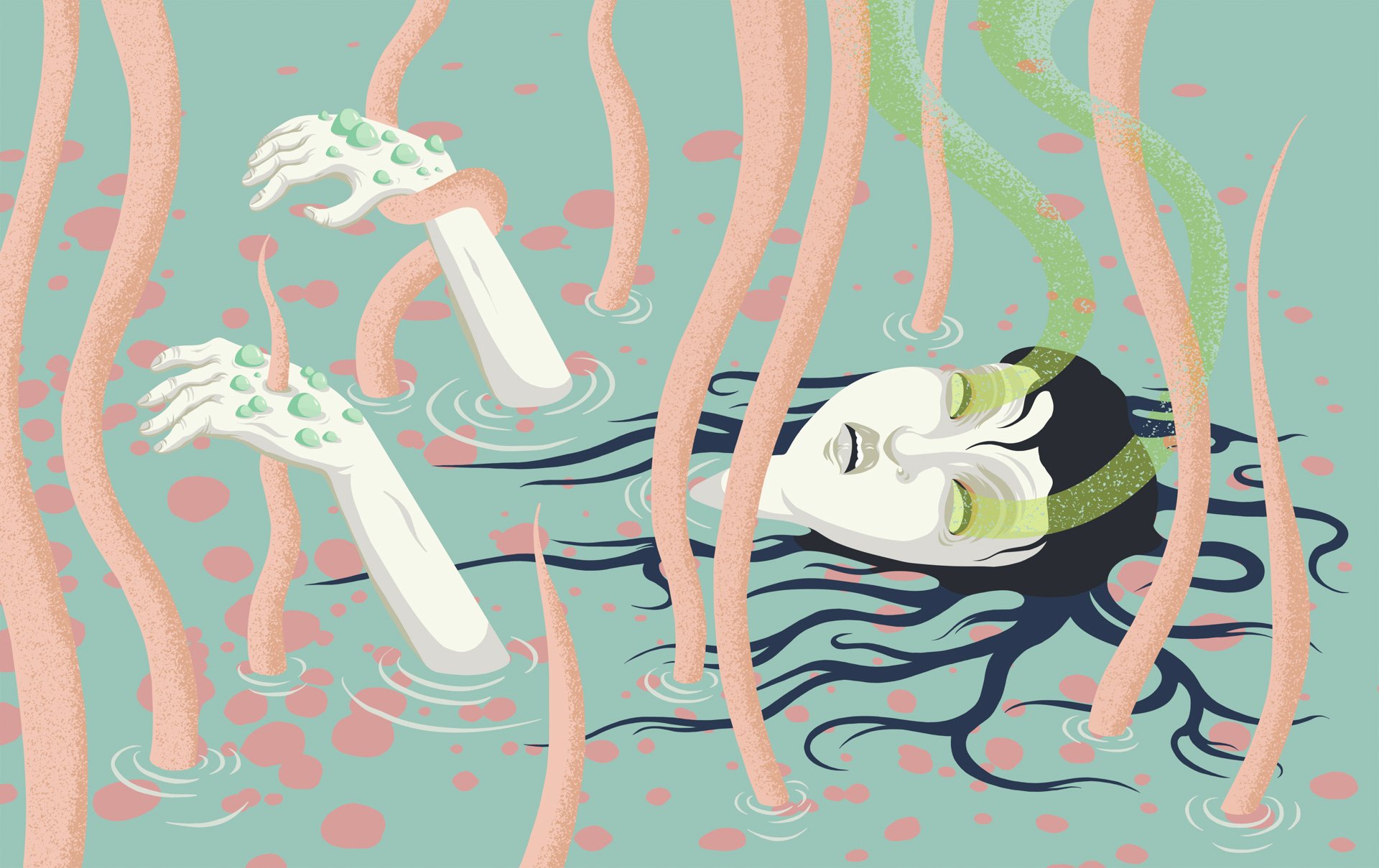
The Undine, 2020, Screenprint, 20" x 32"

Samples of Ink Swatches
What would your work be without color?
When I make a new work of art, the first question I ask is whether I want it to be in color or black and white. If I want to make work in color, I make a print. If I want to make a work in black and white, I tend to create a pencil or ink drawing. I love the natural silvery gray tone of graphite.
I love how the image quality changes when there is such a noticeable absence of color. If by some mysterious reason, I was banished from being able to use color anymore, I would just have to focus on my drawings and dream of a long lost age when color roamed the earth… and in my prints.