
Heather Kahn-Pyatt

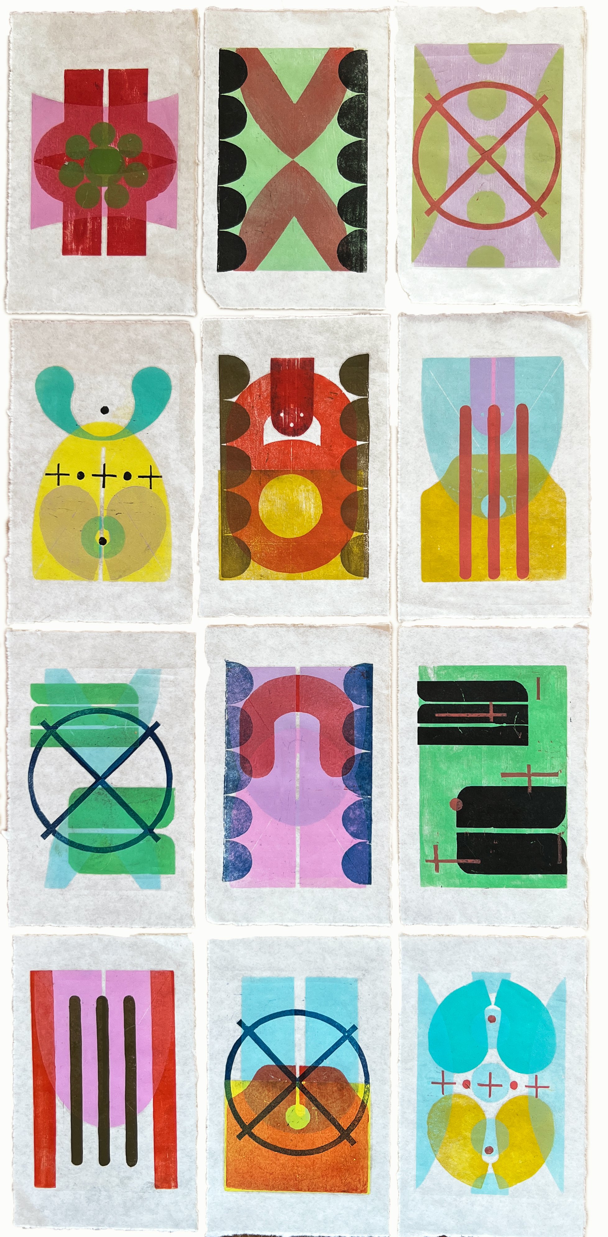
Structures_001, 2017, Monotype and graphite, 9" x 12"
“Time and technique become woven into the print’s identity.”
Heather Kahn-Pyatt is an artist living and working in Boulder, Colorado (USA). Her use of color is both formal and intuitive, and her approach to printmaking is iterative. Heather’s textural and evolving work is created with serigraphy, xylography, linocut, monotype, and monoprint printmaking techniques. Her other ways of working include hand drawings, painting, and pochoir.
Currently, Heather is developing work based on a handful of themes that she has been exploring for the past couple of years, with the hope of creating both larger, unique prints as well as editions.
How does color represent or support the mind space of your work?
I try to create a visual language that speaks to the subtleties of nature, time and personal experience. The work is an effort to distill these elusive things into formal, pictorial and textural elements. What we may see when we think of a place, time or person is complex and layered, and full of association and feeling. I want to catalog, and give substance to what resonates.
Color serves this intention well, because it can be highly evocative, and broad in its associations. Initially I bring color in intuitively, based on a place, time or idea I am thinking about. The quality of light and the atmospheric colors within the built or natural environment imprint on my memory, or, certain colors will simply represent a mood. I see it as creating a lens for my experiences. I don’t feel a need to be overly literal or descriptive. I like things being somewhat fragmented or curious, because that is how I relate to my mind space.
As I develop the images, I become more deliberate- adjusting, adding or subtracting color and layering ink to accentuate opacity (which can also give textural presence) or transparency (which can recede in space or create optical mixtures). Josef Albers’ quote, “Color is the most relative medium in art” rings true in that it is highly dependent not only on each color’s characteristics (its hue, value and chroma), but also the adjacent colors, how much of each is present, the amount of space that lies between and the kind of light that is falling onto the surface of colors. It is truly an exploration that is endlessly challenging while intensely satisfying.
Lower East Side, August, 2022, Woodcut, 12.5” x 24.5”
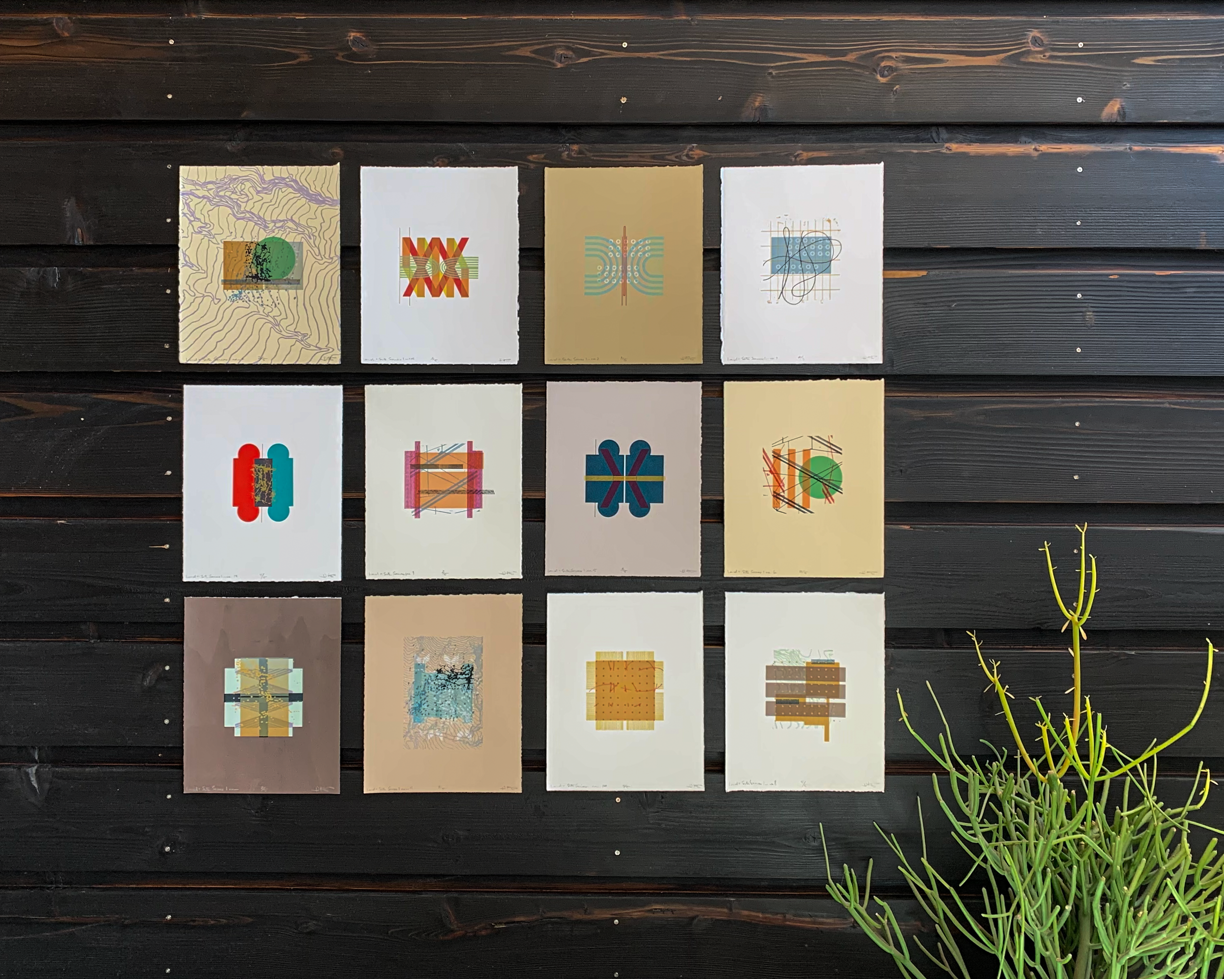
Land + Site Series, Numbers 1-12, 2018 Serigraph edition Individual prints are 8” x 10”, full series is 35” x 33”

Six Hours Walking, 2022, Woodcut, 18.5” x 24.5"
“The quality of light and the atmospheric colors within the built or natural environment imprint on my memory...”
How does the printmaking process itself relate to how you work with color?
My printmaking process is almost always iterative: I do a lot of printing in a “working proof” mode from loose drawings and sketches, allowing for changes and experimentation. Each subsequent print is a result of editing and responding to the previous image. I conceptualize much of the work as series where a motif evolves or repeats with minor changes in order to reiterate or elaborate the theme.
Printmaking seems to lend itself to my blend of painterly, yet graphic sensibilities. It provides just the right amount of structure so I can balance impromptu and planned choices. I like the tactile and physical process of carving, mixing and inking plates–each being so unique and satisfying. Time and technique become woven into the print’s identity.
Ultimately, color is the most challenging and surprising part for me as I work to make the image dynamic, rich and emotive. Our eyes see hue, value and chroma very differently when a color is isolated as opposed to when it is in relation to other colors, and in our observable world, rarely are colors isolated. As artists, we get to manipulate and choreograph color. I have no fear about using color, and while often, my combinations fail to have the results I initially imagine, and require a pretty rigorous critical process, I find it necessary to delve into each project with the idea that I will always discover and learn something I can build upon.

Evolution of Memory, 1 ,2 & 3, 2022, Woodcut, monotype, 50.5” x 15.5”
What would your work be without color?
This is a great question. It’s my belief that value (light to dark/ black to white) is the foundation for, and essential part of any visual composition. The manner in which light is distributed and organized creates the architecture needed for an image to be read and understood.
When I teach color theory, I love accentuating this idea so students become attuned to how they see and represent the value. I think without color–the absence of hue and chroma–my work might be more precise, and bold. The scale would most likely be larger and it would require me to be more rigorous with composition and figure-ground relationships.
When I am using color I get swept up and seduced with the color interactions that evolve, sometimes losing the compositional focus. It is a great exercise, and something I should do from time to time to make my color prints stronger.

Barcelona Series, no. 2, 2023, Linocut and woodcut, 10" x 10"